
Pitch's 2021 design post is four headings: readability, presenting information, consistency, context. Correct, and too polite.
The failure mode is specific. You present on a 1080p Zoom share at 75% window size, or on a washed-out hotel projector. Your 14pt captions vanish. Your three-column comparison becomes mush.
These four tips are written for that room.
1. Readability is a distance problem
White space is not "nice." It is how type survives.
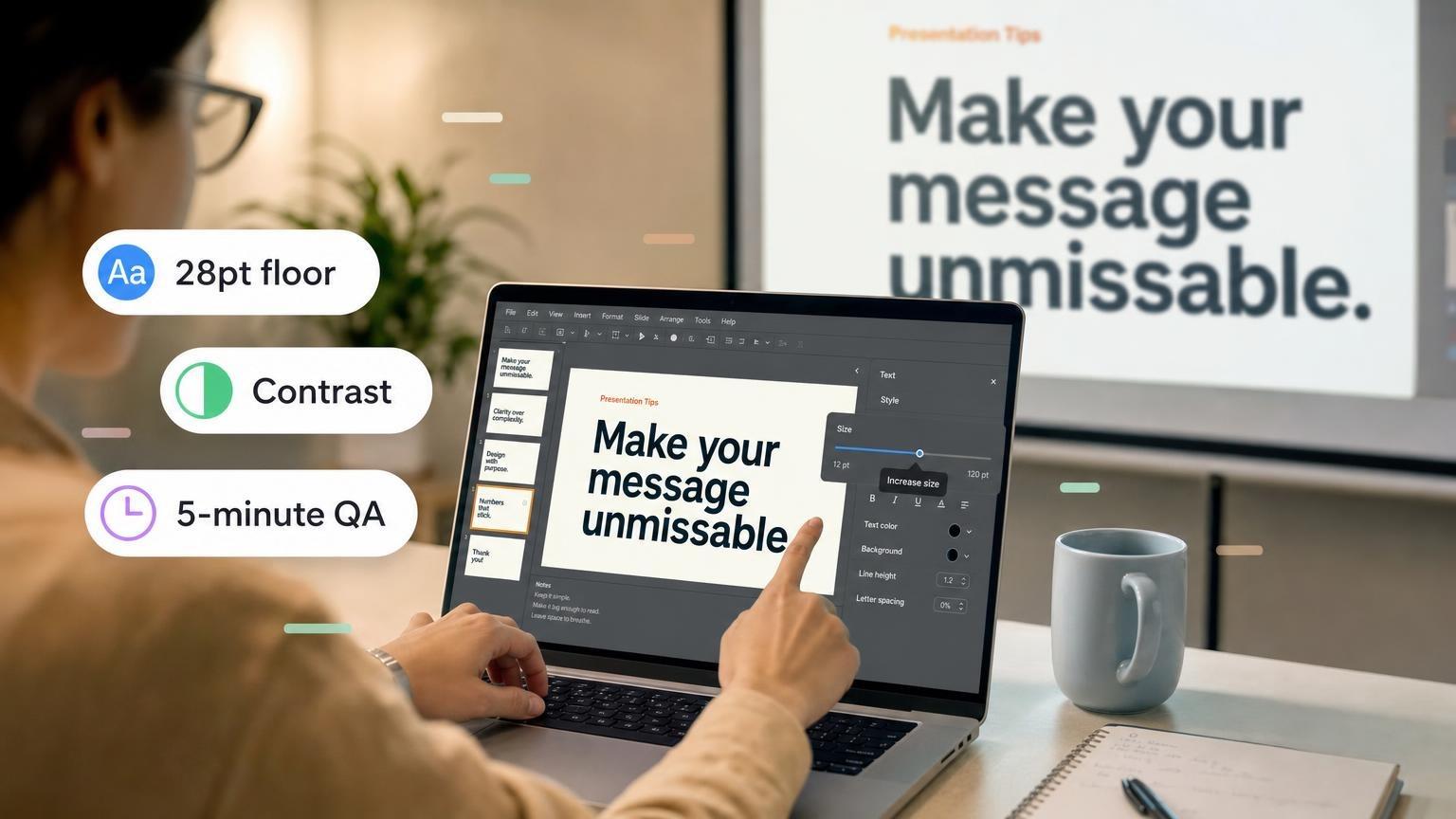
- Headline: 36-44pt. One line if you can.
- Body: 24-28pt on a projector. 18pt only in a leave-behind.
- Line length: under 8-10 words. Long lines fail on 16:9.
- Contrast: body text on photos needs a dark overlay. 4.5:1 contrast is the floor, not a stretch goal.
- x-height: pick a typeface that stays open at small sizes. Thin fashion fonts die on Zoom compression.
Test: stand at the back of the room, or shrink the window to half width. If you squint, fix type, not the background texture.
2. One idea, one focal point
The "rule of three" is useful until it becomes three paragraphs.
Better options:
- One number, huge
- One chart with one series
- Three labels max, each under 6 words
- A 2-step before/after
Hierarchy: the thing you want them to remember should be the largest object. If a decorative icon is larger than the number, you designed a poster, not a slide.
Do not add a second visual "for energy." Energy comes from you talking.
More on this in how to make a good presentation and McKinsey slides.
3. Consistency is a system, not a theme
A theme pack with 40 layouts is how decks start looking like five different products.
Lock on slide 1:
| Token | Rule |
|---|---|
| Type | 2 families, 3 sizes |
| Color | 1 brand, 1 accent, 1 neutral |
| Margins | same on every slide |
| Charts | same palette, no 3D |
| Photos | same crop and treatment |
Section break slides can break the system on purpose. Body slides should not.
If three people edit the file, put the system on a "do not delete" slide at the front.
4. Design for the actual medium
| Medium | What changes |
|---|---|
| Conference hall | Higher contrast, fewer words, thicker chart lines |
| Zoom share | Avoid thin 1px rules; they vanish. Extra margin so UI chrome does not crop you |
| Printed leave-behind | Complete sentences, sources, page numbers |
| Mobile forward | One column. No 6-cell matrices |
A board deck that looks "designed" in Figma and muddy in the boardroom was designed for the designer.
Zoom compression kills detail
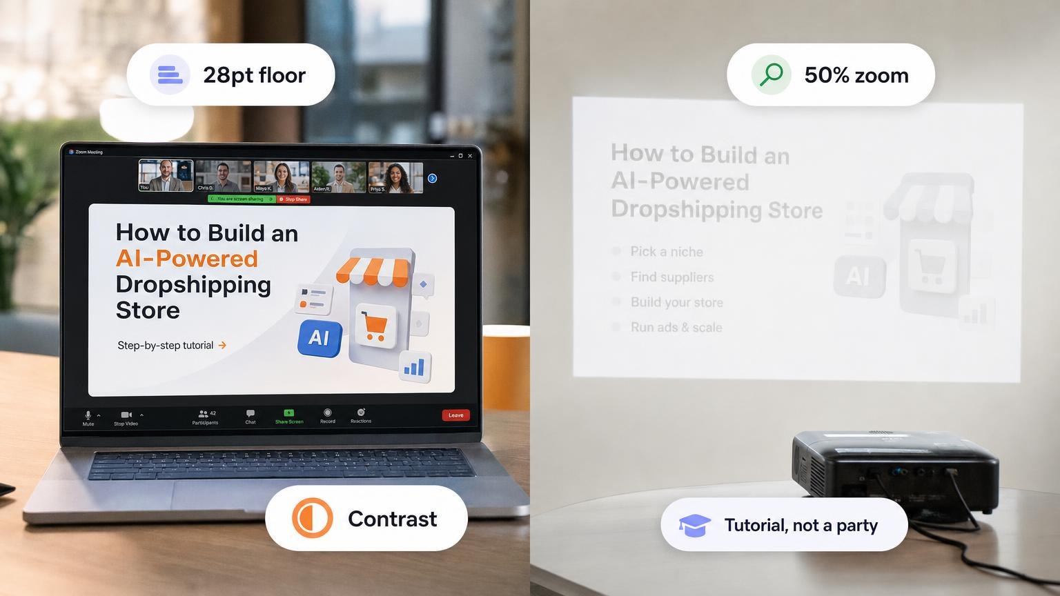
Hotel projectors wash out. Zoom at 75% window size eats 1px rules.
- Avoid 1px lines and hairline icons. Use 2-3px.
- Light gray (
#CCCCCC) on white disappears. Body text: near-black on cream or white. - Thin custom fonts get muddy. Pick a face with a high x-height.
- Drop shadows and 3D charts become noise after compression.
Stand at the back, or shrink the share window. If you squint, it is a type problem, not a "brand" problem.
Charts that read at 50% zoom
One series. Direct labels, not a legend on the right. Line weight you can see on a phone.
Rainbow palettes fail accessibility and fail the projector. Two colors: series + grid.
If the point is "up 32%," consider deleting the chart and using a one-number slide.
Color and accessibility
WCAG 4.5:1 for body text is the floor. Brand pink on yellow is not a personality. It is unread text.
Check contrast once on the title slide, then lock the pair. Do not invent a third accent per section unless it is a section break.
Steal this token sheet
| Token | Starter |
|---|---|
| Type | One sans, sizes 40 / 28 / 18 |
| Color | 1 brand, 1 accent, #111111 text, #F5F5F5 fill |
| Margin | 64px on a 1920x1080 slide |
| Charts | Same two colors, no 3D, no legend if you can label the line |
| Photos | Same crop. Dark overlay when type sits on the image |
Copy these onto a "do not delete" slide. GenPPT can apply one system after the outline is locked.
Board deck vs all-hands (same story)
Same three facts: revenue, headcount, risk.
- Board: three slides, one number each, footnote source.
- All-hands: one storyboard of the quarter, one photo from the floor, one "what we will not do."
Do not send the all-hands file to the board. Density and jokes travel badly.
5-minute QA before you present
- Click through in PowerPoint or Google Slides, not only in the editor preview.
- Check every chart at 50% zoom.
- Search for 12pt text. Kill it or split the slide.
- Confirm the last slide has the ask or the next step.
- Export
.pptxand open it on a second machine if you can.
For structure before design, use pitch deck structure or sales deck examples. For visual risk that still reads, creative presentation ideas.
Pretty is optional. Legible is not.