
The Dribbble Playoff decks Pitch.com celebrated in 2021 look great in a screenshot. Half of them would fail in a real meeting because nobody can read the type from row four.
Creative is not decoration. It is a constraint that makes one idea land harder.
Here are nine ideas you can actually ship this week, plus the cases where you should stay boring.
When creative helps
Use a strong visual idea when:
- The audience has seen 40 decks this month
- The content is a story, not a model
- You have one number that deserves a full slide
- The brand already has a visual language you can steal from
Stay conservative when:
- Legal or finance has to sign the file
- You present on a dim projector
- The deck will be printed in black and white
- You are asking for money and the partner is tired
9 creative presentation ideas
1. One number, full bleed
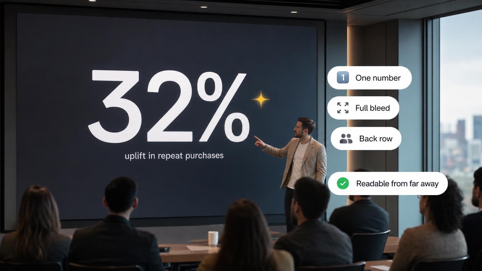
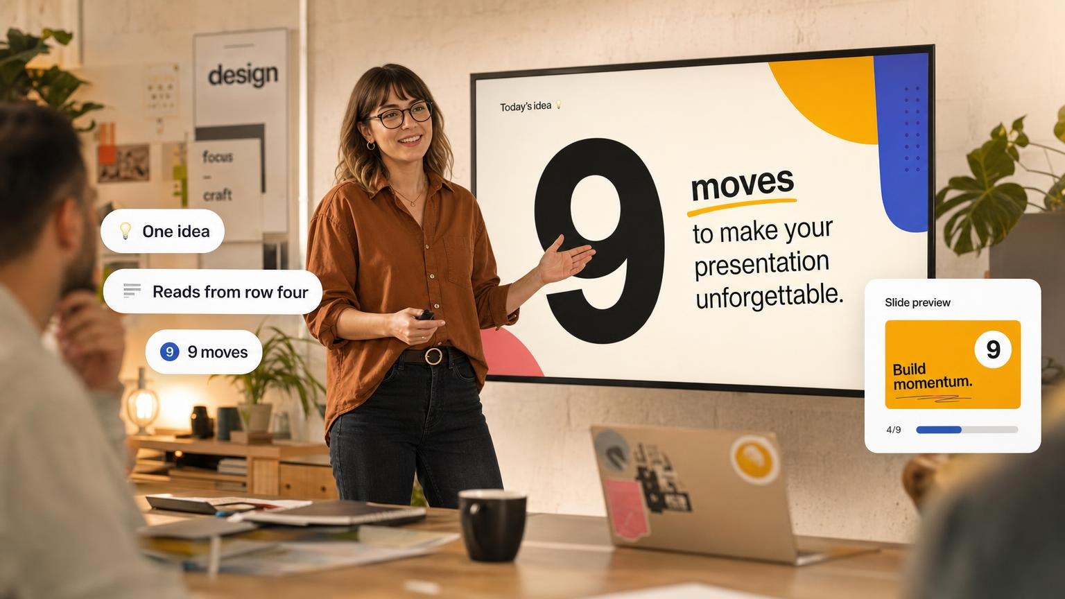
Put 32% on a dark slide. Caption in 18pt under it. Talk for 40 seconds.
This is the McKinsey move and it still works because the room cannot miss the point. See McKinsey slides.
2. Before / after storyboard
Six frames. Left column is the messy current week. Right column is the same week with your product. No icons of rockets.
Works for sales, product launches, and class case studies.
3. The physical prop photo
Photograph the actual thing: the warehouse aisle, the whiteboard after a war room, the invoice stack. Crop tight. One caption.
Stock "happy team at laptop" kills this instantly.
4. Live-looking data, frozen
Design the slide like a dashboard the buyer already uses. Freeze a real (or realistic) snapshot with the date on it. Do not animate 12 widgets.
5. Section titles as scenes
Every chapter gets a full-bleed photo or a color field with a 3-word title. Body slides in between stay white.
This is how long all-hands decks stay navigable.
6. Hand-drawn on a grid
Sketch the system on paper, scan, drop it on a 12-column grid with typeset labels. Feels human without looking sloppy.
Good for architecture talks and early product strategy.
7. Typographic manifesto
No photos. Two typefaces, strict sizes, lots of margin. Think a Swiss poster sequence.
Use this when the words are the product: culture decks, brand films, keynotes.
8. The object scale slide
Show the product next to a coin, a city block, or a week of calendar. Scale is the joke and the explanation.
Hardware, climate, logistics, and bio all benefit.
9. Audience as the last slide
End with their names or a photo of their store / campus / stack, not your logo. The close is "this is about you."
Risky if you get the names wrong. Check spelling twice.
Copy the system, not the Dribbble portfolio
Pitch's playoff roundup is a gallery. Three moves you can steal without copying the art:
- Product as brand. The scooter deck mirrors the object. Use idea 8 (object scale) or idea 3 (prop photo).
- Color as chapter. Hoke's proposal uses color to mark themes. Use idea 5 (section titles as scenes).
- Product-only color. Voice of a Woman's Heart keeps UI color and drains everything else. Use idea 1 plus a muted chrome.
One creative system for a 12-slide deck
Pick one device. Example: section-title scenes (idea 5) plus one-number proof (idea 1).
| Slides | Treatment |
|---|---|
| 1 title | Full-bleed photo, 8-word claim |
| 2-4 body | Quiet white, 28pt, one chart max |
| 5 section | Color field, 3-word title |
| 6-8 body | Quiet |
| 9 proof | One number, full bleed |
| 10-11 body | Quiet |
| 12 close | Their context (idea 9, safer form: their metric or their UI screenshot) |
If a body slide starts matching the section-break energy, you broke the system.
Safer idea 9: screenshot their dashboard or store, or put their Q3 number on the close. Do not guess names.
For topic lists rather than design devices, presentation ideas. For type and contrast, presentation design tips. For structure, pitch deck structure.
Rules so design does not wreck the talk
- Contrast first. Light text on a busy photo fails. Add a scrim.
- One focal point. If the eye has three places to go, it goes to email.
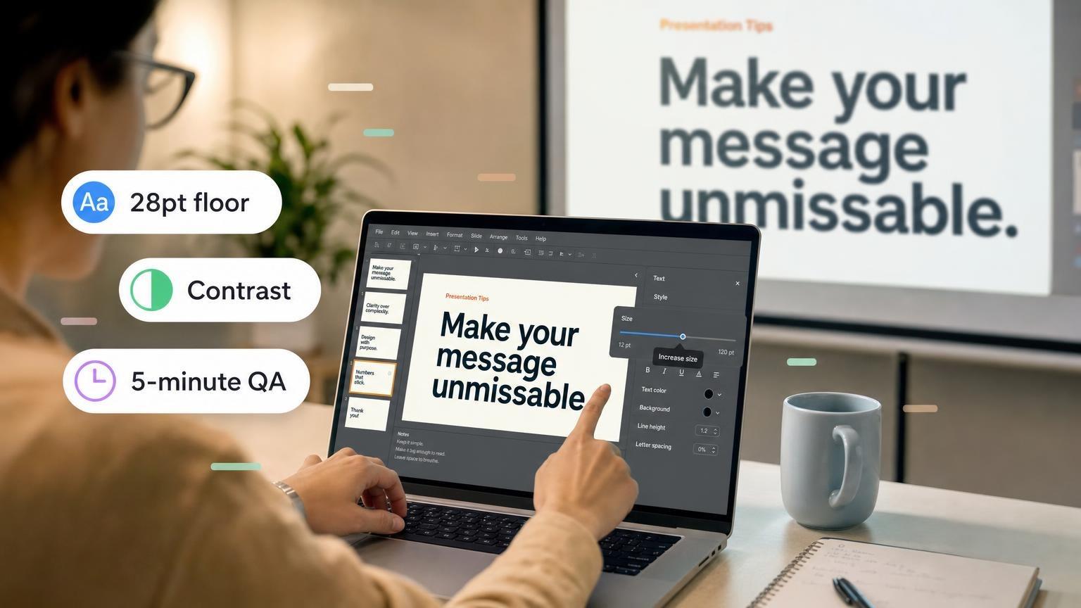
- Type size floor. 28pt body on a projector. 18pt only for footnotes.
- Reuse, don't invent. Same corner radius, same two colors, same icon set.
- Motion is a tax. One GIF in a sales deck is charm. Four is a carnival.
Build the story in plain text. Then pick one idea from the list and run it across titles and breaks. GenPPT can apply a consistent visual system so you are not restyling 18 slides by hand.
Creative that reads is craft. Creative that only photographs well is a portfolio piece. Know which meeting you are in.