

Investors won't fund a company that ignores competitors. Your competition slide maps the market, names real alternatives, and shows the gap your product fills. Most founders trash-talk rivals or paste a logo wall with no point of view.
Three layouts work: 2×2 matrix, comparison table, and "why us" framing, with examples from famous decks, mistakes to avoid, and when experienced investors skip the slide.
If you are new to deck structure, start with What Is a Slide Deck?. For the full fundraising narrative, see our pitch deck hub.
What the competition slide is for
The competition slide answers one question: where do you sit in the market, and why does that position win?
It shows you understand buyer behavior, pricing pressure, and switching costs in your category.
In a standard pitch deck, this slide sits after market size and before your differentiation, product demo follow-up, or go-to-market section. You have established the problem, solution, and TAM. Now show investors who else is fighting for the same budget.
| Slide order (typical seed deck) | What it proves |
|---|---|
| Problem → Solution | Why the market needs you |
| Market size | How big the prize is |
| Competition | Who else is in the fight |
| Why us / GTM | How you win and acquire customers |
| Team → Ask | Why you can execute |
Three layouts that work
Pick one primary format. A matrix, table, and six bullet advantages on the same slide creates noise.
1. The 2×2 competitive matrix
Plot competitors on two axes that matter to your buyer. Put your company in the quadrant you intend to own, ideally one that is empty or under-served.
How to build it:
- Choose two differentiators investors already use when they compare vendors (price vs premium, self-serve vs managed, horizontal vs vertical, etc.)
- Name 3–6 real competitors and place them on the chart
- Highlight your position with a distinct marker: color, size, or label
- Add one line under the chart: the insight investors should repeat in the partner meeting
Airbnb's 2009 deck is the classic reference. They used temporary housing vs hotels on one axis and transactional vs non-transactional on the other. Airbnb landed in transactional temporary housing, a quadrant Craigslist and Couchsurfing did not serve.
When a matrix fails: The axes are vanity metrics ("innovation" vs "quality") or you cherry-pick dimensions that make every competitor look bad. Investors spot that in seconds.
2. The comparison table
A feature grid works when buyers evaluate specific capabilities: integrations, compliance, speed, support tier, pricing model.
| Your product | Competitor A | Competitor B | Legacy incumbents | |
|---|---|---|---|---|
| Core job | ✓ | Partial | ✓ | ✓ |
| Self-serve signup | ✓ | ✓ | ✗ | ✗ |
| API / integrations | ✓ | ✗ | Partial | ✓ |
| Time to value | Minutes | Days | Hours | Weeks |
| Pricing | Usage-based | Seat-based | Custom quote | Enterprise only |
Dropbox's 2007 seed deck used a six-row feature grid against Carbonite, Mozy, Foldershare, and box.net. Dropbox was the only column with green checks on sync, backup, sharing, OS integration, web access, and versioning. One scan tells the white-space story.
Rules for tables:
- Cap at 4–6 comparison rows. More than six reads like a spec sheet
- Use checkmarks, dashes, and short phrases, not paragraphs
- Include at least one row where a competitor wins. Acknowledge tradeoffs
- Highlight your column with restraint; do not neon-highlight every cell
Tables suit B2B SaaS, dev tools, and categories where procurement runs a structured bake-off.
3. "Why us" framing
After you name rivals, stack your advantages. Use this as a follow-up slide or a hybrid: matrix on slide one, "why us" on slide two.
Structure it as 3–5 defensible edges, each tied to behavior investors can verify:
- Distribution: exclusive channel, embedded workflow, or community you already own
- Product: 10× faster setup, proprietary data, or a workflow incumbents cannot copy without rebuilding
- Economics: lower CAC, higher retention, or a take rate incumbents cannot match at your scale
- Timing: regulation change, platform shift, or buyer habit that incumbents are slow to adopt
Airbnb's deck followed the matrix with a competitive advantages slide: six short tiles on host incentives, profiles, and 3-click booking. Operational proof, not adjectives.
Name what is better and for whom. Skip slides that only say "better UX" or "AI-powered."
Real competition slide examples
DoorDash: density and selection
DoorDash's fundraising decks used a matrix or map showing restaurant coverage and delivery speed against Grubhub, Uber Eats, and local options. They won suburban markets incumbents under-served. Geography and supply density beat a generic food-delivery pitch.
Uber: two-sided marketplace positioning
Early Uber decks positioned against taxis and black-car services on availability and price transparency. The competition slide showed cabs as fragmented and offline while Uber was on-demand and tracked in-app.
B2B SaaS: "good enough" vs "best in class"
Vertical SaaS companies table-compare against spreadsheets, manual processes, and one legacy vendor. The win is replacing three tools and cutting onboarding from weeks to days, not out-featureing everyone.
Match axes to your buyer's decision criteria. These are patterns, not copy-paste templates.
Common mistakes founders make
Empty or fake quadrants. A blank chart or a chart with only your logo tells investors you skipped the homework. Include real names.
Trash-talking. "Competitor X sucks" wastes a slide. Show structural advantage.
Wrong competitors. Listing Amazon when you sell HR software for dental offices signals you do not know your ICP.
Too many variables. A "petal" chart with five axes looks clever and reads as confusion. Stick to two axes unless you have a rare, data-backed reason for more.
Feature parity fiction. Claiming you beat everyone on every row destroys trust. Acknowledge tradeoffs.
Stale landscape. A deck from 2024 that ignores a well-funded 2025 entrant makes you look out of touch. Refresh before every fundraise.
Burying the insight. If the slide needs a minute of explanation, simplify the visual or split into two slides.
When investors skip the competition slide
Not every deck needs a full competitive landscape. Experienced investors may skim or skip this slide when:
You are creating a category. Pre-product companies pitching something buyers do not yet budget for may spend more time on problem education and wedge strategy than on a matrix of partial substitutes.
Traction speaks for itself. If you show 40% month-over-month growth, marquee logos, and net revenue retention above 120%, partners care more about unit economics and scale risk than positioning slides.
The competitive story is obvious. In crowded categories (note apps, generic CRMs), investors already know the map. A short "incumbents vs us" table plus one sentence can suffice.
You cover it elsewhere. Some founders weave competition into the problem slide ("teams today use spreadsheets and Slack threads") or the solution slide without a dedicated section. That works if the narrative is clear.
Demo day time limits. Five-minute pitches sometimes cut competition to one spoken line: "We compete with X and Y; we win on Z." The slide deck sent afterward can still include the full matrix.
Include the slide unless you have a deliberate reason to omit it. Skipping it without that reason raises more questions than it saves time.
How to build yours with AI
Draft the competition slide in PowerPoint or use an AI deck builder to structure the full narrative first.
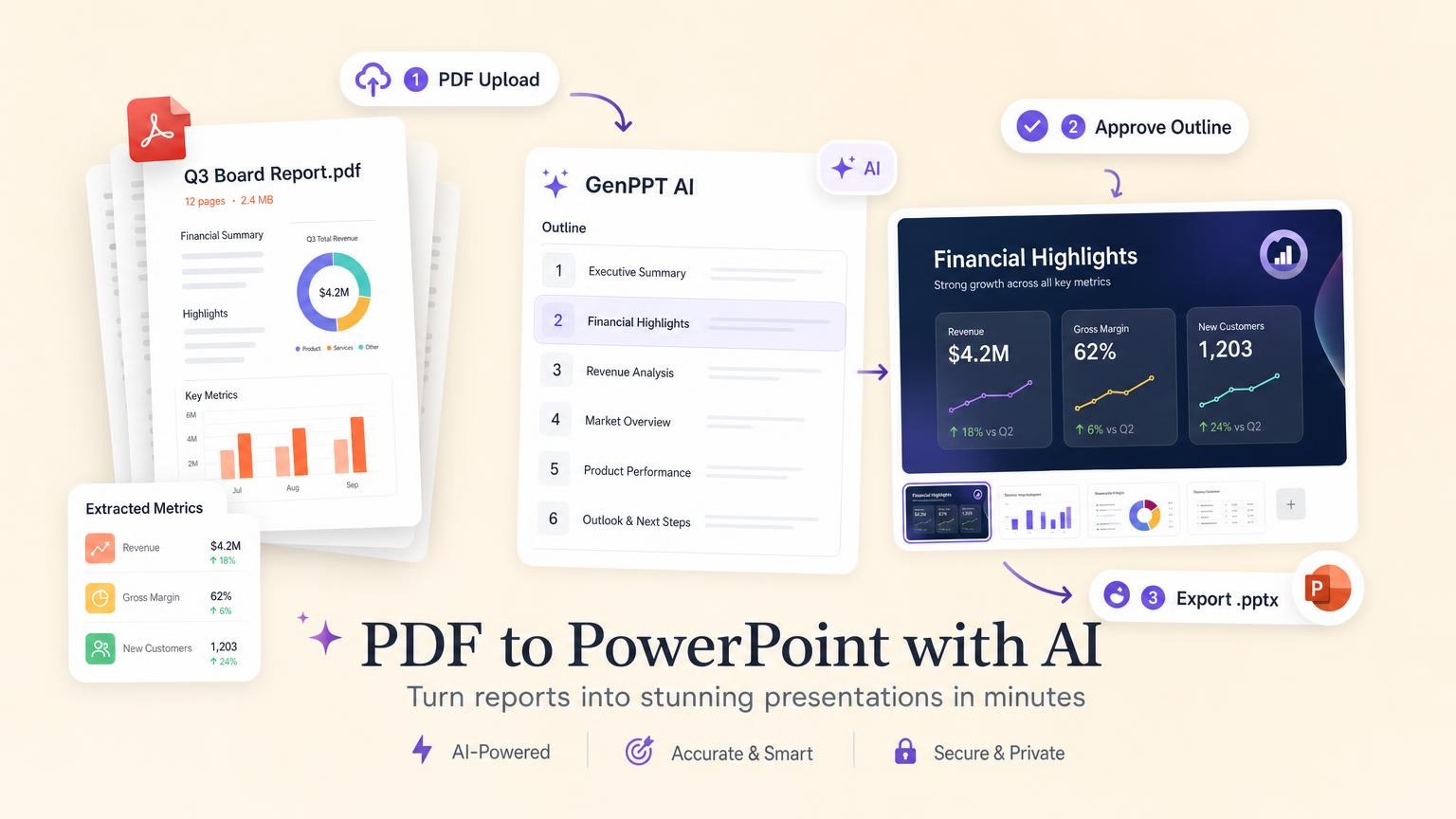
With GenPPT, describe your market and named competitors in the prompt or upload a brief. Approve the outline, then lock a slide titled Competition or Market landscape before generation. Ask for a 2×2 matrix or comparison table in the outline step so the visual direction matches your positioning story.
For the full workflow (upload, outline approval, concept pick, export), see How to Create a PowerPoint with AI.
If you are comparing deck tools while building this slide, our Best Slidebean Alternatives guide covers guided pitch templates and AI-native builders like GenPPT.
Checklist before you present
- Name real competitors: 3–6 companies or clear substitute behaviors (spreadsheets count)
- Pick one primary layout: matrix, table, or why-us stack
- Define axes or rows from buyer research: not from what makes you look good
- State the takeaway in one sentence: what quadrant or column you own
- Pair with proof: traction, LOIs, or product demo that supports the claim
- Rehearse the verbal bridge: "Market is X; incumbents sit here; we win here because…"
Frequently asked questions
What should a competition slide in a pitch deck include?
Name real competitors or substitutes, show where you fit (matrix or table), and state why your position wins. One clear insight beats a logo collage.
Where does the competition slide go in a pitch deck?
Usually after market size and before your differentiation, go-to-market plan, or "why us" slide. Order can shift for demo day time limits, but the narrative flow stays: problem → market → competition → how you win.
What is a 2×2 competitive matrix?
A chart with two axes (e.g., price vs customization, self-serve vs enterprise). You plot competitors in quadrants and highlight the space you target. Airbnb's seed deck is the most cited example.
Should I include competitors if we have none?
Every product competes with something: spreadsheets, manual work, status quo, or "do nothing." Name substitutes. Do not claim zero competition.
How many competitors should I list?
Three to six named companies or categories. Enough to show market awareness, not so many that the slide becomes unreadable.
Is it okay to say competitors are bad?
No. Investors assume you are biased. Show structural advantages: speed, cost, distribution, data.
Can I use Gartner's Magic Quadrant style?
You can, but generic "leader/challenger/niche" quadrants look templated. Custom axes tied to your buyer's decision process work better.
When should I skip the competition slide?
Shorten or skip when you are pre-product in a new category, traction already answers "why you," or a five-minute pitch forces cuts. Keep the competitive story somewhere in the deck or appendix.
How do I make a competition slide in PowerPoint?
Insert a SmartArt matrix or build a two-axis scatter chart with labeled competitor logos. For a table, use a simple grid with checkmarks and short phrases. AI tools like GenPPT can draft the slide from a prompt that names your competitors and positioning.
Build your competition slide today
Map your market, pick the layout that matches how buyers decide, and tie the visual to one sentence investors can repeat.