
Ever feel like your team's process is a tangled mess of emails, Slack messages, and crossed wires? You know what needs to be done, but getting everyone on the same page is a constant struggle. It’s stressful and kills your team's momentum.
The good news? A simple diagram can fix it. Mapping out your process visually turns confusion into clarity. It gives your team a single source of truth that guides everyone’s actions and ends the guesswork.
This isn’t just about making things look neat; it’s about building a smarter, more predictable system for your work. A clear workflow diagram helps you spot bottlenecks, streamline handoffs, and find opportunities to improve. For a deeper dive into optimization, exploring Business Process Automation (BPA) can show you how to take your processes to the next level.
This guide breaks down 7 essential workflow diagram examples, from high-level business process maps to detailed swimlane charts. You’ll learn which diagram to use for your specific challenge and how to turn your finished map into a sharp, clear presentation. Let’s get you started.
1. Business Process Model and Notation (BPMN)
Business Process Model and Notation (BPMN) is the gold standard for creating a detailed and standardized workflow diagram example. Think of it as a universal language for your business processes. Its main goal is to provide a visual map that's easy for everyone on your team to understand—from analysts to the developers implementing the process.
BPMN’s strength is its precision. While a simple flowchart shows the basic steps, a BPMN diagram captures complex details like timing, specific triggers, and message flows between your departments. This level of detail removes guesswork, making it a powerful tool for process analysis and improvement.
When to Use a BPMN Diagram
BPMN is your best choice when you need to document, analyze, or automate a complex business process with multiple stakeholders and systems. It’s perfect for:
- Process Automation: Clearly defining your workflow before you implement it in a management system.
- Regulatory Compliance: Documenting processes for audits where precision is critical, like in finance or healthcare.
- Cross-Functional Collaboration: Mapping workflows that cross multiple departments, like an insurance claim moving from agents to adjusters to your finance team.
How to Customize and Present Your BPMN Diagram
- Define Your Scope: Start by clearly identifying where the process begins and ends.
- Identify Roles: Use "swimlanes" (horizontal or vertical rectangles) to represent different people or departments. This instantly clarifies who is responsible for what.
- Map the Happy Path: First, diagram the ideal process flow from start to finish.
- Add Exceptions: Now, add decision points (gateways) and map out alternative paths for when things don't go as planned.
- Turn it Into a Presentation: A complex BPMN diagram can overwhelm your audience on a single slide. Instead, you can create a presentation with AI that walks your team through the process one step at a time, making it much easier to understand and approve.
2. Flowcharts (Traditional Process Diagrams)
Flowcharts are one of the most intuitive ways to create a workflow diagram example. They use simple, universally recognized shapes and arrows to show your process steps, decision points, and the overall flow of work. Their simplicity is their greatest strength.
A flowchart’s goal is to give you clarity and quick understanding. By mapping out a sequence of actions from a clear start to a defined end, you help your team understand how a system works, identify potential roadblocks, and solve problems faster. To see how simple flowcharts inform user experience, check out these checkout flow design examples.

When to Use a Flowchart
Flowcharts are perfect when you need to explain a process clearly and quickly, without getting lost in technical details. They are great for:
- Onboarding and Training: Explaining a standard operating procedure (SOP), like a customer service troubleshooting guide, to your new team members.
- Simple Project Planning: Outlining the key phases of a small project or your content production workflow.
- Problem-Solving: Mapping a debugging process to ensure your team takes consistent actions.
How to Customize and Present Your Flowchart
- Use Standard Symbols: Stick to recognized shapes: ovals for start/end points, rectangles for process steps, and diamonds for decisions.
- Establish a Clear Flow: Arrange your diagram to flow from top to bottom and left to right. This logical direction makes it easy for anyone to follow.
- Keep Decisions Simple: Limit questions inside diamond shapes to simple "Yes/No" outcomes to keep the paths clear.
- Label Everything: Make sure every shape and arrow is clearly labeled so there's no confusion about the action or direction.
- Turn it Into a Presentation: A flowchart is the perfect visual backbone for your presentation. You can easily automate your slides by using the flowchart’s steps as your outline, creating a dedicated slide for each major phase to guide your audience through the logic.
3. Use Case Diagrams (Unified Modeling Language - UML)
A Use Case Diagram is a behavioral workflow diagram example that shows how your system interacts with outside users (or "actors"). Instead of detailing the internal logic, it gives you a high-level, user-centric view of what a system is supposed to do. Think of it as a blueprint for your user requirements.
Its power comes from its focus on the user. A use case diagram answers the critical questions: Who uses your system, and what can they do with it? This clarity is essential in the early stages of design to ensure everyone on your team is aligned on the project’s goals.
When to Use a Use Case Diagram
A Use Case Diagram is your go-to tool during the initial requirements-gathering and analysis phases of a project. Use it when you need to:
- Define System Requirements: Clearly outline the features of a new mobile app or e-commerce website from your end-user's perspective.
- Communicate with Stakeholders: Present a simple, visual overview of the system’s scope to non-technical stakeholders for feedback.
- Model User-System Interactions: Map out how different types of users (like customers, admins, and guests) will interact with your system.
How to Customize and Present Your Use Case Diagram
- Identify Actors and Goals: Start by listing all the users and their primary goals. What does each actor need to accomplish?
- Define Use Cases: For each goal, create a use case (an oval) with a clear, action-oriented name like "Make a Deposit" or "Search for a Product."
- Map Relationships: Draw lines connecting actors to the use cases they interact with.
- Add System Boundary: Enclose all use cases within a rectangle to represent the boundary of your system. This clarifies what's internal versus external.
- Turn it Into a Presentation: A diagram showing every interaction can get busy. Use a tool like GenPPT to focus your presentation. You can create a presentation with AI that highlights one actor and their use cases per slide, making it easier for your audience to follow and provide targeted feedback.
4. Swimlane Diagrams (Cross-Functional Flowcharts)
A Swimlane Diagram is a powerful workflow diagram example that visually separates tasks and responsibilities. It organizes your process steps into horizontal or vertical "lanes," with each lane representing a different role, department, or system. This structure makes it incredibly easy to see who is responsible for what.
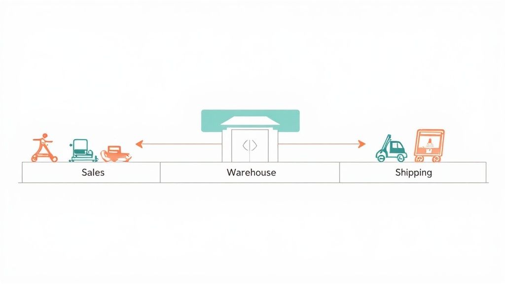
The primary strength of a swimlane diagram is clarity. By assigning each step to a specific lane, you eliminate confusion about ownership. This is crucial for identifying bottlenecks and communication gaps in processes that span multiple teams. If your process feels slow, a swimlane diagram can immediately show you where handoffs are failing.
When to Use a Swimlane Diagram
Swimlane diagrams are your go-to choice for mapping processes that involve multiple people and require clear accountability. They are ideal for:
- Order Fulfillment: Tracking an order as it moves from your sales team to the warehouse and finally to shipping.
- New Employee Onboarding: Visualizing the steps handled by HR, IT, and the hiring manager to get a new hire set up for success.
- Cross-Functional Projects: Clarifying roles and handoffs in complex projects, like a new product launch involving R&D, marketing, and sales.
How to Customize and Present Your Swimlane Diagram
- Identify Participants: Start by listing every department or role involved in the process. Each one gets its own lane.
- Define Boundaries: Clearly establish the starting and ending points of the workflow you're mapping.
- Map the Process: Place steps in the appropriate lanes, using arrows to show the flow of work, especially as it crosses between lanes.
- Simplify and Clarify: Keep the diagram clean and ensure each handoff is clearly represented by an arrow moving from one lane to another.
- Turn it Into a Presentation: Instead of showing the entire map at once, break it down. You can build a presentation that focuses on one lane at a time or highlights critical handoffs. This is key for how to make presentations more engaging and ensures your audience understands their specific role.
5. Sequence Diagrams (UML - Behavioral Modeling)
A Sequence Diagram is a powerful workflow diagram example that visualizes how objects and systems interact with each other over time. Think of it as a script, where each actor delivers messages in a specific sequence to move the process forward.
The strength of a Sequence Diagram is its temporal clarity. It uses vertical lifelines to represent objects and horizontal arrows for messages, making it easy to follow the chronological flow of an interaction. This makes it invaluable for your developers trying to understand, design, or debug complex communication patterns.
When to Use a Sequence Diagram
Sequence Diagrams are your go-to choice when you need to model the timing and order of operations within a system. They're ideal for:
- API and Microservice Design: Visualizing the sequence of API calls between different services to fulfill a user request.
- System Troubleshooting: Tracing a sequence of events to pinpoint where a process, like an authentication flow, is failing.
- Understanding Complex Logic: Mapping out real-time interactions before your team writes any code.
How to Customize and Present Your Sequence Diagram
- Identify Participants: Define the key actors or systems involved and place them as lifelines across the top of your diagram.
- Map Message Flow: Draw arrows from one lifeline to another to represent messages. Number them sequentially to make the order of operations crystal clear.
- Add Control Logic: Use UML fragments like "alt" (for if-else choices) and "loop" to show conditional logic or repetitive actions.
- Keep it Focused: For complex systems, create separate diagrams for distinct use cases to keep each one clean and readable.
- Turn it Into a Presentation: A detailed sequence diagram can be dense. You can create a presentation with AI that animates the message flow step-by-step, guiding your audience through the interaction logically and making the entire process easier to grasp.
6. Data Flow Diagrams (DFD)
A Data Flow Diagram (DFD) is a unique workflow diagram example that focuses specifically on how data moves through a system. Instead of mapping tasks, a DFD illustrates the journey of information itself: where your data comes from, where it goes, where it's stored, and the processes that transform it.
A DFD's main purpose is to visualize the logical components of an information system. This makes it an essential tool for systems analysis and identifying potential data security vulnerabilities. By tracing the flow of data, you can spot inefficiencies or gaps in your information architecture.
When to Use a DFD Diagram
A DFD is the ideal choice when your primary concern is the information, not the sequence of human actions. It's perfect for:
- System Design and Analysis: Documenting an existing system or designing a new one, like an e-commerce platform's data pipeline.
- Data Security and Compliance: Identifying every point where sensitive data is stored or transferred, which is crucial for regulations like GDPR.
- Database Development: Understanding your data requirements before designing the schemas for a CRM or an Electronic Health Record (EHR) system.
How to Customize and Present Your DFD Diagram
- Start with the Big Picture: Begin with a "Level 0" or context diagram. This shows your entire system as a single process with its inputs and outputs.
- Break it Down: Expand the context diagram into a "Level 1" DFD, showing the major processes within the system. Use strong verb-noun pairs like "Process Payment."
- Map Data Stores: Add and label data stores (like "Customer Database") to show where information rests between processes.
- Ensure Consistency: Check that all data flowing into and out of a process is accounted for.
- Turn it Into a Presentation: You can start your presentation with the high-level context diagram on one slide. Then, create a presentation with AI to dedicate subsequent slides to each "Level 1" process, explaining the detailed data flows to your team without overwhelming them.
7. State Machine Diagrams (UML - State Behavior)
A State Machine Diagram is a specialized workflow diagram example that models how an object or system moves through a series of states. It visualizes the lifecycle of a single entity, showing its possible states, the transitions between them, and the events that trigger those changes. Think of it as a biography of an object in your system.
Its power lies in its focus on behavior. It answers the question, "What state is the object in now, and what could cause it to change?" This makes it invaluable for designing systems where an object's behavior depends entirely on its current state, such as an order's status or a user's authentication level.
When to Use a State Machine Diagram
This diagram is your go-to tool when you need to model the complex, event-driven behavior of a single object within your system. It's ideal for:
- Software and Systems Engineering: Modeling the behavior of a user session, a document's approval lifecycle, or a network connection.
- Embedded Systems: Designing control logic for devices like a traffic light or an ATM.
- Game Development: Defining the behavior of a character as it reacts to in-game events, changing from "idle" to "patrolling" to "attacking."
How to Customize and Present Your State Machine Diagram
- Identify All Possible States: Begin by listing every single condition the object can be in. For an online order, this includes "Pending," "Processing," "Shipped," and "Delivered."
- Define Transitions and Triggers: Map the paths between states. What event causes an order to move from "Processing" to "Shipped"? Label each transition with its trigger.
- Add Guards and Actions: Specify any conditions (guards) that must be true for a transition to occur (e.g., "payment confirmed").
- Check for Dead Ends: Make sure every state has a clear path forward or is a designated final state.
- Turn it Into a Presentation: The lifecycle of an object is a story. You can create a presentation with AI to animate the flow, highlighting one state and its potential transitions per slide. This transforms a static diagram into a dynamic story that helps your team instantly understand the system's behavior.
7 Workflow Diagram Types Compared
| Diagram | 🔄 Implementation complexity | ⚡ Resource requirements | ⭐ Expected outcomes | 📊 Ideal use cases | 💡 Key advantages |
|---|---|---|---|---|---|
| Business Process Model and Notation (BPMN) | High — steep learning curve; many symbols and rules | Moderate–High — modeling tools, training, possible licensing | ⭐⭐⭐⭐ — precise, executable workflows enabling automation | Complex enterprise workflows, BPM automation, regulatory processes | Standardized notation; strong business–IT alignment; scalable |
| Flowcharts (Traditional Process Diagrams) | Low — intuitive shapes and simple logic | Low — basic drawing tools or paper | ⭐⭐⭐ — clear for simple processes; not executable | Training, SOPs, troubleshooting guides, simple decision trees | Extremely accessible; quick to create and modify |
| Use Case Diagrams (UML) | Low–Moderate — focus on actors and goals, simple notation | Low — UML tools or whiteboard; stakeholder input | ⭐⭐⭐ — clarifies requirements and system scope | Requirements gathering, scope definition, early system design | Identifies actors/goals; aligns stakeholders; good for scope |
| Swimlane Diagrams (Cross-Functional Flowcharts) | Moderate — adds lanes and handoffs that increase layout complexity | Low–Moderate — diagramming tools and accurate role mapping | ⭐⭐⭐⭐ — clarifies responsibilities and reveals inefficiencies | Cross-department processes, handoff-heavy workflows, process improvement | Visualizes ownership and handoffs; highlights bottlenecks |
| Sequence Diagrams (UML - Behavioral Modeling) | Moderate–High — complexity grows with participants and messages | Moderate — UML tools and technical/system knowledge | ⭐⭐⭐⭐ — detailed message ordering and interaction clarity | API design, microservices interactions, integration sequencing | Shows timing/order of messages; useful for integration planning |
| Data Flow Diagrams (DFD) | Moderate — requires disciplined leveling and abstraction | Moderate — analyst time and modeling tools | ⭐⭐⭐ — clear data movement and security insights; not temporal | Data architecture, EHR, BI/data-pipeline design, legacy systems | Emphasizes data sources/stores and transformations; security focus |
| State Machine Diagrams (UML - State Behavior) | High — many states/transitions can be complex to model | Moderate–High — domain expertise, modeling tools, thorough event definitions | ⭐⭐⭐⭐ — precise state behavior; prevents invalid transitions | Protocols, embedded/reactive systems, order/status workflows | Models state-dependent behavior; can be translated to executable code |
Turn Your Workflow Diagram Into a Winning Presentation
You've just explored everything from the precision of a BPMN chart to the clarity of a Swimlane Diagram. We've broken down each workflow diagram example as a strategic tool to solve a specific business challenge. Whether you're mapping a complex software pipeline or simplifying your client onboarding, the goal is always the same: turn complexity into a clear, actionable plan.
But the real power isn't just in creating the diagram. It's in using it to get your team aligned, secure approvals, and inspire action. A workflow diagram tells the story of how your work gets done. It highlights bottlenecks, clarifies roles, and reveals opportunities for innovation.
Simply emailing a diagram and hoping for the best rarely works. You need to present it with context, confidence, and a clear narrative to make it stick.
From Static Map to Dynamic Story
The best diagrams become the centerpiece of your project kickoffs, training sessions, and executive briefings. To make your workflow truly resonate, remember these core takeaways:
- Clarity Over Complexity: Your goal is to make a process understandable at a glance. If your stakeholders are confused, the diagram has failed.
- Context is King: Always explain the "why" behind your diagram. What problem does this process solve? What are the expected outcomes?
- Focus on Your Audience: Tailor your explanation to who you're speaking to. Your engineering team needs a different level of detail than your marketing team.
Your Next Step: From Diagram to Deck
Mapping out your process is the critical first step. The next is communicating it effectively. A well-structured presentation is your best tool for getting buy-in and making sure everyone understands their role. Instead of starting from a blank slide, let your diagram's logic guide your presentation's flow.
You've done the hard work of defining the process. Now, let's make sure it gets the attention and adoption it deserves. Turn your structured notes into a compelling narrative that moves your team from understanding to action.
Ready to transform your process maps into a persuasive presentation? Stop building slides from scratch. GenPPT turns your detailed notes and workflow logic into a clean, professional deck in minutes. Get your team aligned and your project moving. Try GenPPT today