
Your seed round pitch deck is your startup's story in a dozen or so slides. It's the sharp, compelling presentation you'll use to get investors excited about your vision, your team, and the massive market you're about to conquer.
Let's be clear: its main job isn't to close the deal on the spot. It's to get you the meeting. Your deck needs to be confident and laser-focused on proving you have a unique insight into a big, expensive problem.
What Investors Actually Want in a Seed Deck
Before you open a single slide, let's get inside the head of the person on the other side of the screen. Investors aren't just scanning your data; they're betting on your vision. More importantly, they're betting on you and your team.
A killer seed round pitch deck is your ticket to a real conversation. Before you dive into the nitty-gritty of your deck, it helps to understand the fundamentals of what a pitch deck is and its role in this whole process.
Your mindset needs to shift from just presenting facts to telling a story that pulls them in. At this stage, investors know your financial projections are mostly educated guesses. What they're really looking for are signals that de-risk their investment. They want to know if your team has an insight that everyone else missed.
The Realities of the Fundraising Grind
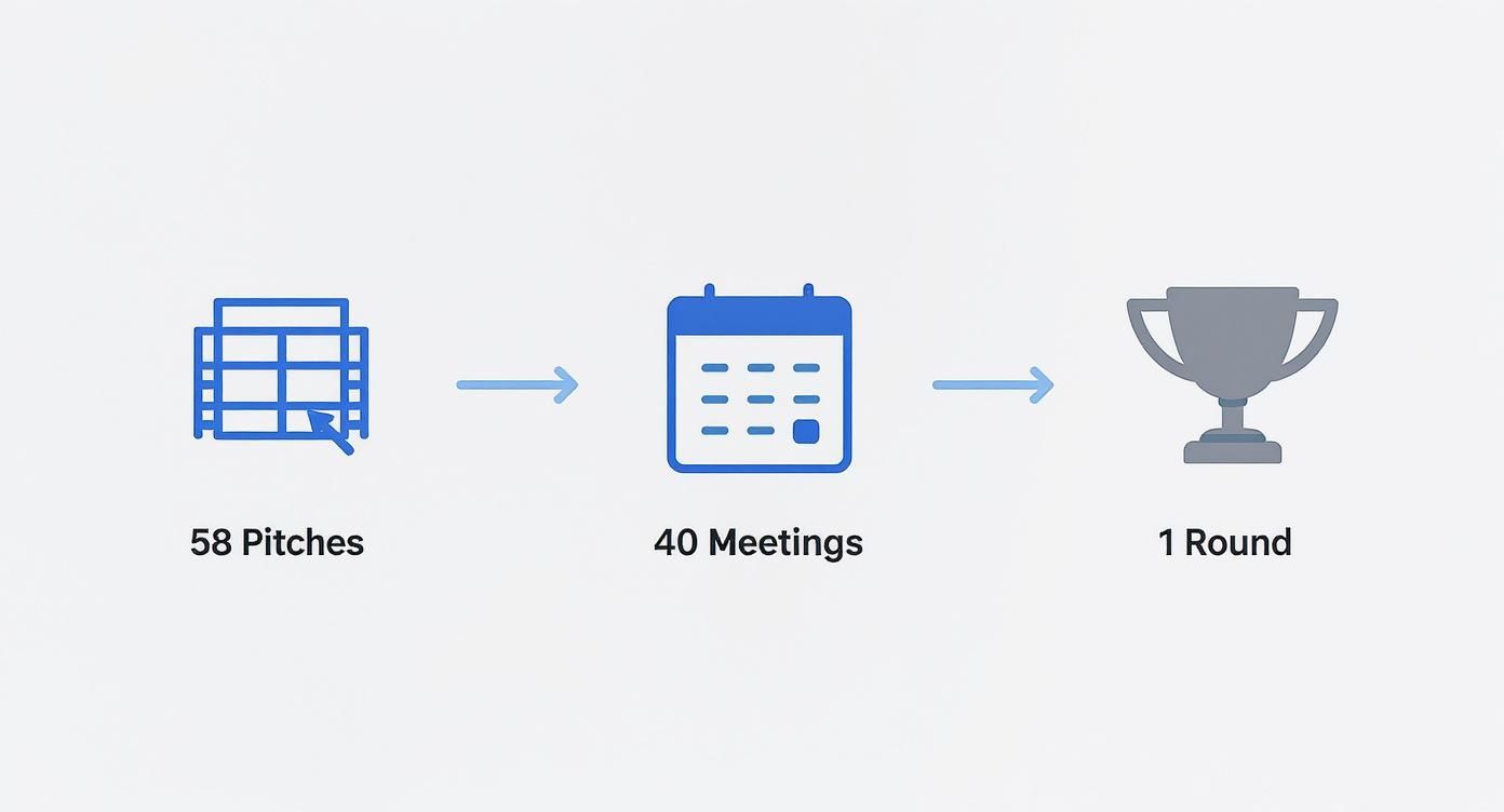
Raising money is a marathon, not a sprint. You've got to be ready for the grind. On average, founders pitch their deck to 58 different investors and take around 40 meetings just to close a seed round.
The competition is fierce. Some VCs see 3,000 decks a year and might only invest in nine of them. That math tells you everything: your pitch has to cut through the noise from the very first slide.
This process highlights a crucial truth: your resilience matters just as much as your idea. You'll hear "no" a lot. But every rejection is a chance to sharpen your story and make your pitch that much stronger.
More Than a Deck—It's a Conversation Starter
Think of your deck as the key that unlocks the door. Its purpose is to be so clear and compelling that an investor feels they have to talk to you. They're looking for answers to a few core questions:
- Founder-Market Fit: Why are you the one? Why is this team uniquely equipped to solve this specific problem?
- A Massive Opportunity: Is this market big enough to generate the 100x returns they need?
- Early Momentum: Do you have any traction—no matter how small—that proves your idea has legs? Think glowing user feedback, a successful pilot, or a growing waitlist.
Your deck needs to answer these questions with confidence. To get your framing right, check out our deeper guide on how to pitch investors. Remember, your goal isn't just to share information; it's to build conviction.
Building Your Narrative Slide by Slide
Your pitch deck is a story, not a spreadsheet. Each slide is a chapter, pulling the investor deeper into your world and building their conviction. A great narrative gets you the meeting; a mediocre one gets you archived. You're building a case that makes your company feel inevitable.
Let's walk through the essential slides. The key isn't to cram every data point onto the screen. It's about choosing the most powerful facts to build momentum, one slide at a time.
Make no mistake, fundraising is a numbers game. You're up against hundreds of other decks.
This just drives home how critical a tight, punchy narrative is. With VCs swimming in pitches, yours has to grab them from the start.
To get there, we'll map out the essential slides you need. This table gives you a high-level look at the story you're about to tell.
Essential Seed Round Pitch Deck Slides
Here's a breakdown of the core slides, their purpose, and what you need to include in your narrative.
| Slide Number | Slide Title | Core Purpose |
|---|---|---|
| 1 | Title | Grab attention and state your mission clearly. |
| 2 | Problem | Make the investor feel the pain your customers face. |
| 3 | Solution | Introduce your product as the clear, elegant answer. |
| 4 | Market Size | Show the massive scale of the opportunity. |
| 5 | Product | Demonstrate how your product works and its "magic." |
| 6 | Business Model | Explain exactly how you make money. |
| 7 | Traction | Prove you have momentum and customers love you. |
| 8 | Team | Show why you're the only team that can win. |
| 9 | Competition | Acknowledge competitors and define your unique edge. |
| 10 | The Ask | State precisely what you need and how you'll use it. |
Now, let's dive into what each of these slides needs to do.
The Opening Act: Hooking the Investor
Your first few slides are everything. You have seconds to establish what you do, why it matters, and who you are. Nail this, and they'll lean in. Fumble it, and they're already clicking to the next deck.
- Slide 1: The Title Slide: Keep it clean. Your company name, logo, and a single, powerful tagline. "Intelligent invoicing for creative freelancers." Done.
- Slide 2: The Problem: This is your hook. Frame a problem that is painful, expensive, or urgent. Use a relatable story or a shocking stat to make the investor feel the pain.
- Slide 3: The Solution: Now, you swoop in. Introduce your product as the hero—the elegant answer to the messy problem you just laid out. "We're an AI-powered platform that saves freelancers 10 hours a week."
Key Takeaway: The Problem and Solution slides are a one-two punch. If an investor can't immediately grasp what you do and why it's a big deal after these two slides, the rest of your deck is dead on arrival.
The Second Act: Proving the Potential
Okay, you've got their attention. Now you need to prove this isn't just a clever idea, but a massive, venture-scale opportunity. This is where you build your business case.
- Slide 4: Market Size (TAM, SAM, SOM): Show them the money. Start with the huge Total Addressable Market (TAM), then narrow it to your Serviceable Available Market (SAM) and your initial beachhead, the Serviceable Obtainable Market (SOM).
- Slide 5: The Product: Time to show, not just tell. Use crisp mockups, screenshots, or a link to a short demo. Focus on the core user experience and that "magic moment" that makes your solution special.
- Slide 6: Business Model: How do you make money? Be specific. Is it a tiered SaaS subscription? A transaction fee? Clearly state your pricing and why it's a no-brainer for your customer.
Investors poured around $145 billion into US and Canadian startups in the first half of 2025 alone. But with VCs spending an average of just 3 minutes and 44 seconds on each deck, your story has to be incredibly sharp. Every slide must earn its place.
The Third Act: Building Trust and Credibility
The final act is about de-risking the investment. You've shown them a big problem and a great solution; now you have to prove you're the team that can pull it off.
- Slide 7: Traction: For many investors, this is the most important slide. Show your momentum. This could be user growth, revenue, or key partnerships. A simple, upward-trending chart is pure gold.
- Slide 8: The Team: Investors bet on people, not just ideas. Showcase your founding team with headshots and brief bios. Highlight domain expertise or any "unfair advantage" that makes you the perfect group for this problem.
- Slide 9: Competition: Yes, you have competitors. Acknowledging them shows you've done your homework. Use a simple 2x2 matrix to show how you're different and, more importantly, better.
- Slide 10: The Ask: Be direct. State exactly how much you're raising and how you'll use that capital. A simple breakdown (e.g., 40% product, 40% marketing, 20% ops) shows you have a plan.
Getting this story right takes serious thought. For a deeper dive into creating that flow, our guide on https://genppt.com/blog/how-to-structure-a-presentation is a great resource.
As you put the pieces together, always keep the core principles of how to create a pitch deck that wins funding in mind. If you're stuck staring at a blank page, tools like GenPPT can turn your messy notes into a structured first draft, letting you focus on honing your story.
An idea is just an idea until you prove it has legs. For investors, traction is the single most important signal that your vision is turning into a real business. It's the proof that transforms your story from a compelling "what if" into an undeniable "what is."
This is where you show, not just tell. Your traction slide is often the one investors flip to first because it cuts through the noise and answers their biggest question: "Is this thing working?"

What Traction Looks Like Pre-Revenue
Don't panic if you don't have revenue yet. Early-stage traction comes in many forms, and your job is to frame your early wins as proof of momentum. Investors are looking for signals that you're making smart progress with limited resources.
Here are the kinds of pre-revenue metrics that build serious credibility:
- User Growth: A simple chart showing a steady increase in sign-ups or active users is powerful. A "hockey stick" curve, even on a small scale, is the visual every investor wants to see.
- Engagement Metrics: This proves people don't just sign up; they actually use and love your product. Metrics like Daily Active Users (DAU), session length, or repeat usage rates are gold.
- Waitlist Numbers: A rapidly growing waitlist creates a sense of urgency and proves demand before you’ve even fully launched.
- Pilot Program Results: Showcase data from successful pilots. Highlight testimonials or key outcomes that prove your solution delivers real value.
- Letters of Intent (LOIs): These agreements from potential customers stating they intend to purchase your product are a powerful signal of future revenue.
Your goal here is to present this data in a clean, visual way. A single, clear chart is always more effective than a slide crowded with numbers. It should tell a story of progress at a single glance.
The Power of Social Proof
Beyond user metrics, social proof is your secret weapon. It’s the evidence that other smart, credible people are already betting on you. When you have respected names in your corner, it makes an investor's decision to join them much easier.
A study of 17,500 startup pitch decks found that listing existing investors makes a startup 2.3 times more likely to raise a seed round. This isn't just a "nice to have"—it's a significant lever. The same analysis showed that winning decks balance these hard numbers with strong storytelling.
So, how do you showcase this on a slide?
Key Takeaway: Investors are pattern-matchers. When they see that other respected investors or advisors have already done their due diligence and committed, it significantly lowers the perceived risk and builds instant credibility.
Leveraging Advisors and Key Hires
Your team extends beyond your co-founders. Highlighting strategic advisors or impressive early hires can be just as impactful. This shows you can attract top-tier talent who believe in your vision.
Think about who you have in your network:
- Strategic Advisors: Have an advisor with deep industry expertise or a successful exit? Feature their name, title, and why their involvement is a game-changer.
- Key Hires: Did you just hire an engineer from a top tech company or a marketing lead with a track record of scaling startups? This signals your company is a magnet for talent.
When you're building out your slides, it can be tough to visualize how all these pieces fit together. For inspiration, it's always helpful to look at some of the best pitch deck examples from companies that successfully raised their rounds.
Ultimately, your traction and social proof slides tell a story of momentum. They transform your pitch from a theoretical exercise into a tangible opportunity that feels like it’s already taking off. With or without revenue, your job is to package every small victory into compelling evidence that your team can execute and win.
Designing a Deck That Gets Read
Your story can be brilliant, but if it’s wrapped in a messy, unreadable design, it’s dead on arrival. The first impression an investor gets of your professionalism and attention to detail comes from the look and feel of your seed round pitch deck.
You don’t need to be a professional designer, but you do need to understand that design is about clarity. A well-designed deck makes your core message easy to grasp in seconds. A bad one creates friction and quietly signals that you might not have your act together.

Keep It Clean and Scannable
Investors are busy. Let's be real—they aren't reading your deck like a novel. They're scanning it for key signals, and your job is to make those signals impossible to miss.
The single most powerful design principle is simplicity. Cluttered slides with walls of text are the fastest way to get your deck tossed in the virtual trash. Every single element—every word, chart, and image—has to earn its place. If it doesn't add value, cut it.
A few non-negotiable rules for readability:
- One Idea Per Slide: Stop trying to cram everything onto one slide. Give each core concept its own space to breathe.
- Embrace Whitespace: Negative space is your best friend. It guides the eye and makes your key points pop.
- Use Large, Legible Fonts: Stick to something clean like Helvetica or Open Sans. And make sure it’s big enough—a 24pt font size is a safe minimum.
Maintain Brand Consistency
Your deck is an extension of your company's identity. A consistent visual theme makes your presentation feel cohesive and professional, building subtle trust with the investor.
This doesn't mean you need a 50-page brand guide. Just stick to a few simple rules from start to finish.
Key Takeaway: Consistency signals intentionality. It shows you’ve thought through the details, which is a proxy for how you’ll run your business. A sloppy deck suggests a sloppy approach.
Before you start, define a simple style guide:
- Color Palette: Pick two or three primary colors and stick to them. One for headlines, one for body text, and an accent color is all you need.
- Typography: Choose one font for headers and another for the body. Use them on every single slide.
- Logo Placement: Put your logo in the same spot on every slide (usually a corner) to maintain a professional feel.
Use Visuals to Tell the Story
Humans process images 60,000 times faster than text. When you have a chance to show something instead of just describing it, take it. Visuals are your shortcut to making complex ideas simple and memorable.
But please, avoid generic stock photos. Every image needs to add value and feel authentic.
- Simple Charts and Graphs: Use clean bar charts, line graphs, or pie charts to make your data digestible at a glance.
- Product Screenshots and Mockups: Show your product in action. A few high-quality screenshots are infinitely more powerful than a paragraph of features.
- Icons and Simple Illustrations: Use icons to represent concepts and break up walls of text. They add visual interest without creating clutter.
Getting the design right can feel overwhelming. This is where tools like GenPPT can be a lifesaver. It handles the design heavy lifting, letting you focus on telling a killer story, confident that your final deck will look polished and professional.
Fatal Pitch Deck Mistakes to Avoid
You’ve poured your heart into this idea. Your story feels right and your team is ready to go. But even the most promising startups get a hard pass because of simple, unforced errors in their seed round pitch deck.
Think of this as your pre-flight check. Most decks fail for the same handful of reasons. Spotting these traps now means your hard work gets the attention it deserves, instead of getting tossed aside for an easily fixed mistake.
The Vague Value Proposition
This is the number one deck killer. If an investor can't figure out what you do and why it matters within 60 seconds, you've already lost them. They aren't going to decipher your jargon-filled mission statement.
So many founders fall in love with their own buzzwords: "We're a synergistic, AI-driven platform empowering hyper-local communities." It sounds impressive, but it means nothing.
The fix is brutally simple: be clear. "We're a scheduling app that helps plumbers book more jobs and get paid faster." One is corporate-speak; the other is a real business.
Unrealistic or Nonexistent Financials
Look, everyone knows your five-year revenue projections are a fantasy. The mistake isn't being wrong about the future; it's showing you have no clue how a business actually works.
Some founders throw in a hockey-stick graph predicting $100 million in revenue by year three with zero evidence. That immediately tanks your credibility. On the flip side, some decks avoid financials entirely, which signals you haven't thought about how you'll make money.
Key Takeaway: Investors aren’t betting on your spreadsheet. They’re betting on your understanding of your business model. Show them your key assumptions—like customer acquisition cost (CAC) and lifetime value (LTV)—and how they lead to a profitable business.
Ignoring the Competition
Saying "we have no competition" is one of the fastest ways to get a "no." It tells an investor you either haven't done your homework or there's no market for what you're building. Both are terrible signals.
Every problem has a solution, even if that solution is a clunky spreadsheet. Your job is to acknowledge the landscape and show precisely why your approach is better. This demonstrates market awareness and strategic thinking.
The Weak or Confusing Ask
Your 'Ask' slide is the call to action for your entire pitch. A common mistake is being too vague. An ask for "$1.5 million" with no context is meaningless.
Your ask needs to be a specific number tied to concrete milestones. How will this capital get you from point A to point B? What key goals will you hit over the next 18-24 months that make your company more valuable?
To bring this home, let’s look at how winning decks handle these common challenges.
Pitch Deck Mistake vs. Winning Strategy
Here’s a direct comparison of the errors that sink decks and the strategies you should use instead.
| Common Mistake | Why It Fails | Winning Strategy |
|---|---|---|
| Too Much Text | Investors don't read; they scan. Walls of text guarantee your most important points get missed. | Stick to one core idea per slide, supported by strong visuals and minimal text. Let your images tell half the story. |
| Bad Design | An ugly, inconsistent deck signals a lack of attention to detail across your entire company. | Keep it clean, on-brand, and use plenty of whitespace. Your deck's look reflects your professionalism. |
| No Story | A deck that's just a random collection of facts is instantly forgettable. It lacks emotional punch. | Build a clear narrative: Problem → Solution → Why Us → Why Now. Make the investor the hero who helps you win. |
Avoiding these fatal errors isn't about creating a "perfect" deck. It’s about removing any friction that stops an investor from seeing the massive opportunity you've uncovered. Don't let a simple, fixable mistake stand between you and the capital you need.
Your Seed Round Deck Questions Answered
Even with a perfect template, building your seed round pitch deck can feel like you're walking through a minefield. It's normal to have questions about the unwritten rules and what investors really expect. Let's clear the air and tackle the questions I hear from founders all the time.
How Long Should My Pitch Deck Be?
Your deck should be 10-15 slides, max. Seriously. Investors are drowning in decks and don't have time for a 30-page novel.
Your only goal is to be concise enough to land the meeting. Think of your deck as the movie trailer, not the full film. Every slide has to earn its spot. If it feels redundant, cut it.
Should I Include Detailed Financial Projections?
Absolutely not. At the seed stage, a five-year projection is pure fantasy. Presenting one can hurt your credibility because it shows you don't understand how early-stage ventures work.
Instead, dedicate a slide to your business model. Show how you make money, your key assumptions (like LTV and CAC), and your high-level path to profitability. A simple summary of your goals for the next 18-24 months is all you need.
Key Takeaway: Your financial slide is about demonstrating strategic thinking, not fortune-telling. Show you know the levers that drive your business, and you'll build far more trust than a wild hockey-stick graph ever could.
What Is the Single Biggest Mistake to Avoid?
The most common and fatal mistake is a lack of clarity. It’s that simple. If an investor can't figure out what you do, what problem you solve, and for whom within the first 60 seconds, they’re already gone.
You have to frame your solution in simple, outcome-focused language. The best gut-check? Show your first three slides to someone who knows nothing about your industry. If they don't get it immediately, your message isn't sharp enough. Simplify.
How Much Money Should I Ask For?
Your "ask" can't be a random number. It needs to be a specific amount tied to clear, achievable milestones. Don't just say you're raising "$1.5M." Frame it as, "We are raising $1.5M to achieve X, Y, and Z over the next 18 months."
This proves you have a concrete plan for every dollar. Your milestones should be meaningful goals that make the company more valuable and set you up for your next round. For example:
- Reaching 10,000 monthly active users.
- Hitting $50k in monthly recurring revenue (MRR).
- Launching key features to unlock the enterprise market.
A well-defined ask shows you're not just asking for cash—you're asking for the fuel to execute a very specific plan.
Ready to build a deck that answers every question with confidence? With GenPPT, you can turn your notes and data into a polished, professional seed round pitch deck in minutes. Let our AI handle the structure and design, so you can focus on telling your story. Create your winning deck today.