
Before you even think about picking fonts or background colors for your deck, you need a solid structure. It’s the one thing that makes your message actually stick.
We’ve all sat through those presentations, right? The ones that wander all over the place, leaving you more confused than when you started. A great structure is your best defense against that. It’s the invisible framework that guides your audience from point A to point B, making even your most complex ideas feel simple and clear.
When you structure your presentation, you’re not just organizing slides—you’re crafting a journey for your listener. This clarity does wonders for your confidence, but more importantly, it helps your audience follow along without getting lost or bored. People are 40% more likely to remember what you said if it’s presented in a clear, logical sequence.
A strong framework helps you:
- Speak with Confidence: When you know your flow, you won’t get lost or ramble. It’s your safety net.
- Deliver a Clear Message: Your audience can easily follow your main points and walk away with the key takeaways.
- Keep People Engaged: A good story has a beginning, a middle, and an end. So does a great presentation. This narrative arc keeps people leaning in.
The best presentations don't just share information—they tell a story. Your structure is the plot that makes your story memorable.
This is where a tool like GenPPT can be a huge help. It turns your messy notes into a clean, clear deck in minutes. That way, you can jump straight to refining your message instead of staring at a blank page.
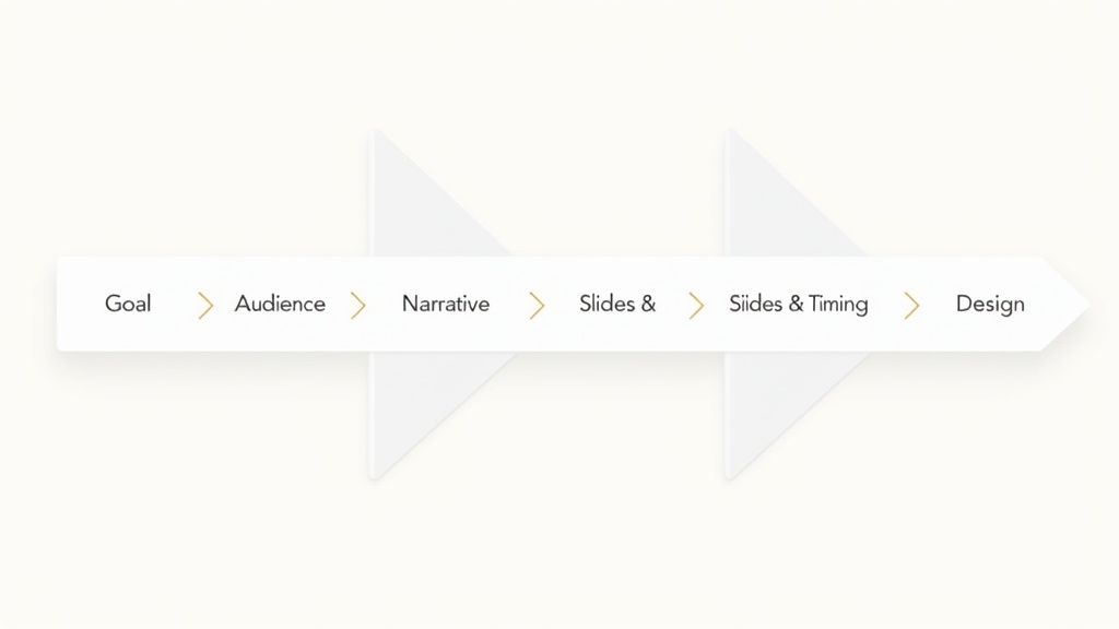
Your Cheat Sheet for a Killer Presentation Structure
To make this simple, here’s a quick breakdown of what to do for each element of your presentation.
| Element | Your Action | The Result |
|---|---|---|
| Goal | Define what you want your audience to do, think, or feel. | A focused message that drives a specific outcome. |
| Audience | Understand their needs, knowledge, and what they expect. | Content that feels relevant and built just for them. |
| Narrative | Create a clear beginning, middle, and end. | A compelling story that keeps your listeners engaged. |
| Slides & Timing | Plan your slide count and time for each point. | A sharp delivery that respects everyone's time. |
| Design | Use visuals to guide attention and clarify your ideas. | A professional look that makes your message pop. |
Nailing these five elements is the foundation of any killer presentation. It’s the difference between a talk that gets forgotten and one that makes a real impact.
Start with a Clear Goal for Your Presentation
Before you touch a single slide, stop and ask yourself one question: What’s the point?
Seriously. Without a clear goal, your presentation is just a bunch of slides looking for a purpose. Your objective is the North Star for every decision you make, from the stories you tell to the data you highlight.
Knowing your desired outcome is what separates a vague talk from a sharp, actionable one. Are you trying to land $50,000 in seed funding? Your goal isn’t just to "present your idea"—it's to convince investors their money will come back tenfold. Are you teaching a complex process? Your goal is to make sure every person in the room can actually do it afterward.
Define Your Desired Outcome
A great way to start is by finishing this sentence: "After my presentation, I want my audience to..." This simple exercise forces you to think beyond just sharing information and focus on the action you want to create.
- To Inform: "I want my audience to understand the three main causes of supply chain disruption."
- To Persuade: "I want the board to approve our new marketing budget."
- To Inspire: "I want my team to feel excited and motivated about our Q4 priorities."
A clear goal is your ultimate filter. If a slide or story doesn't directly serve your main objective, cut it. It’s that simple.
This kind of focus is more important than ever. Audiences now expect more than data dumps. They expect a clear purpose delivered with a compelling narrative.
How Will You Measure Success?
Okay, you have a goal. But how will you know if you hit it? Defining success makes your objective real and measurable.
For a sales pitch, success might be scheduling a follow-up meeting with 75% of the prospects in the room. If you're running a training session, maybe it’s a 90% pass rate on a quick quiz afterward.
To get a true read on your impact, close the feedback loop. Sending a survey with a few essential post-event survey questions is a brilliant way to gauge what landed. This intel is gold for refining your approach next time. Once you know what winning looks like, you can build your entire presentation to make it happen.
Know Your Audience to Maximize Your Impact
You can have the most brilliant idea in the world, but if you pitch it to the wrong crowd—or in the wrong way—it’s going to fall flat. You simply can’t connect if you don't know who you're talking to.
The foundation of a great presentation isn't your slides; it's empathy. Before you even think about your narrative, you have to get inside your listeners' heads.
What do they already know? What are their biggest headaches right now? And what do they expect to walk away with after your time together?
How to Get Inside Their Heads
You don’t need a massive research budget to figure this out. A little smart detective work goes a long way.
- Chat with a few people: If you can, ask a few attendees one simple question: "What would make this presentation a home run for you?" Their answers are pure gold.
- Do some LinkedIn sleuthing: Check out their profiles. Are you talking to executives focused on the bottom line, or engineers who want the technical details?
- Review past Q&As: If you can, look at questions from similar meetings. These reveal recurring concerns you can get ahead of.
Your goal is to make them feel like you created this presentation specifically for them—because in a way, you did.
Think about it: a sales rep pitching new software to C-suite executives would focus on ROI and strategic advantages.
But when presenting to developers, they'd dive deep into the tech stack and API documentation. Same product, totally different presentation structure—all driven by the audience.
Turn Your Insight into Action
Once you have this intel, every other decision becomes easier. This knowledge directly shapes your tone, how complex your data can be, and the stories you tell.
For new hires, you’ll use more foundational examples. For seasoned experts, you can skip the basics and jump straight to the advanced concepts they came for.
Doing this groundwork is how you build trust from your first slide. You can also weave in potent audience engagement strategies to keep them hooked. When your audience feels understood, they don’t just listen—they lean in.
Crafting Your Presentation’s Narrative Flow
Here's a hard truth: facts are forgettable. Stories stick.
The most powerful presentations aren't just a list of data points; they're a journey. They have a clear beginning, a compelling middle, and a satisfying end. This narrative makes your core message impossible to ignore.
Think of yourself as a guide. You're leading your listeners from a problem to a solution, or from a question to a clear answer. This is how you connect.
Build a Compelling Arc
You don't need to reinvent the wheel. The classic three-act structure is timeless for a reason—it just works.
- The Beginning (The Setup): Start with the current situation. Then, introduce a problem or a shared challenge. This is how you hook your audience and give them a reason to care.
- The Middle (The Confrontation): This is the heart of your presentation. You present your evidence, data, and examples. You build your case and guide the audience through the messy details.
- The End (The Resolution): Finally, you deliver the payoff. Present your solution, your key takeaway, or your call to action. It should circle back to the problem you introduced at the start.
Your job is to create momentum. Each slide should logically follow the last, building on the previous point and setting up the next one.
Use Proven Storytelling Frameworks
You don't have to invent a narrative from scratch. There are proven models you can adapt to fit your topic.
The Problem-Solution framework is perfect for sales pitches. You start with a pain point your audience knows all too well, then you introduce your idea as the perfect solution.
Another powerful model is the Hero’s Journey. Here, you cast your audience as the hero facing a challenge. Your product or idea becomes the "magic sword" that helps them achieve their goal.
Presentations built around storytelling are 22 times more likely to be remembered than decks that just list facts. When you combine a strong narrative with compelling visuals, you make your ideas stick.
Mapping this out can feel like a lot of work. A presentation outline generator can help you quickly map your story arc, ensuring your message flows logically from start to finish.
Get Your Timing and Slide Count Right
Figuring out how many slides to use is where great presentations are won or lost. Nail the rhythm, and your audience is with you. Get it wrong, and they're checking their phones before you even hit your second point.
Your slide count isn’t about cramming in information; it’s about respecting your audience's attention. With the average human attention span at just eight seconds, every slide has to earn its place.
Over 20% of attendees admit to multitasking during presentations. That’s a clear signal: a slow, dense talk is an invitation to tune out.
Find the "Just Right" Number of Slides
So, where do you start? For most presentations, Guy Kawasaki's 10/20/30 rule is a brilliant benchmark: 10 slides, delivered in 20 minutes, using a 30-point font.
You don't have to follow it perfectly, but the principle is gold: be concise. This framework forces you to be ruthless with your content, stripping away everything but the essential message. It also gives you breathing room, so you’re not rushing through your final points.
Pacing for Different Scenarios
Of course, not every presentation is a 20-minute pitch. The real skill is adapting your pacing to the format.
- The Quick Pitch (5–10 minutes): Think 5-8 slides, max. Each one needs to land a single, powerful punch. Hit the hook, the core idea, and a clear call to action.
- The Standard Talk (20–30 minutes): This is the sweet spot for 10-15 slides. It gives you roughly two minutes per slide—plenty of time to explain a concept without feeling rushed.
- The Deep Dive (60+ minutes): Forget the "two minutes per slide" rule. Instead, break your content into 15-20 minute modules. Plan for interactive moments between each one—like a quick poll or a Q&A—to reset everyone's attention.
Think of your presentation's timing like a song. You need changes in tempo—moments of high energy, quiet pauses for reflection, and a strong finish.
Ultimately, your job is to guide the audience, not bury them in information. Planning your timing is how you give your message the space it needs to land.
And if you're looking for a shortcut, learning how to create a presentation with AI can help you outline your slides in minutes, setting you up for success from the start.
Use Design and Visual Hierarchy to Guide Your Audience
A great structure gives your presentation a skeleton, but design gives it a personality. It’s the visual language that guides your audience’s eye, making your key points pop and your data easy to understand.
Without a clear visual hierarchy, even the most logical story can feel confusing. The goal is to make your slides so intuitive that understanding them feels effortless.
This means being intentional about every choice, from the colors you pick to the amount of empty space you leave on a slide. Every element needs a purpose.
Guide Their Eyes with Smart Choices
Great design isn't about being flashy; it's about clarity. You want to create a visual path that leads your audience straight to the most important information.
Start with your color palette. You only need two or three complementary colors. Use cool colors like blues for backgrounds and save warm, attention-grabbing colors like reds or oranges for key data points. This contrast naturally tells people what to focus on.
The same rule applies to fonts. Stick to one font for your headlines and another for your body text. This consistency makes your deck feel professional and easy to scan.
Your slides should pass the "glance test." Can someone look at your slide for three seconds and instantly get the main idea? If not, simplify it.
A balanced design also uses whitespace—the empty areas—to prevent visual clutter. Giving your text and images room to breathe makes your content feel less intimidating and far more approachable.
Make Your Data Memorable
When it comes to presenting data, your choices can either clarify or confuse. The right visual turns a dry statistic into a powerful insight.
- Charts vs. Infographics: Use a simple bar chart to show a trend. For more complex stories, an infographic can combine icons, text, and data into one compelling visual.
- Spotlight Key Numbers: Don't just list a statistic in a bullet point. Make it huge. Dedicate an entire slide to one critical number to give it the impact it deserves.
- One Idea Per Slide: This is a golden rule. Resist the urge to cram multiple charts onto one slide. Let each point have its own moment.
Achieving this level of design consistency used to take hours. Now, tools like GenPPT handle that for you. It automatically applies professional design principles, ensuring your colors, fonts, and layouts are always on-brand. You can focus on your message, knowing the visuals will support it perfectly.
For a deeper dive into what separates an average deck from an unforgettable one, check out our guide on what makes a good presentation.
Quick Answers to Your Presentation Structure Questions
Still wrestling with how to structure your presentation? That's completely normal. Let's clear up a few common sticking points.
Getting these details right gives you the confidence that your structure is solid from start to finish.
What’s the ideal slide count for a 30-minute talk?
My rule of thumb? Aim for around 12–15 slides. This gives you about two minutes per slide—the sweet spot for explaining a key point and moving on without rushing your audience.
This pacing keeps the energy up and leaves you breathing room for those natural pauses or audience interactions that keep everyone tuned in.
Your goal isn't to cram every detail onto the screen. It's to deliver a clear, memorable message. A handful of impactful slides will always beat a cluttered deck.
How do I balance deep data with simple clarity?
The best way to handle this is to dedicate each slide to one hero data point. Don't throw up a dense spreadsheet and expect people to follow along. Instead, pull out the single most important number or trend and make it the star of the show.
Use a big, bold chart to make that number pop. If you have backup data, just mention you’ve included it in a handout or are happy to discuss it in the Q&A. This keeps your slides clean and your message sharp.
Can I really reuse one deck for different audiences?
You absolutely should. The secret is to build a modular presentation. Think of it like LEGO bricks. You have your core slides that tell your main story, plus optional "modules" with specific examples or case studies.
Before you present, just swap these modules in and out to perfectly match that audience's needs. It's a massive time-saver and ensures your content always feels like it was made just for them.
Ready to stop overthinking your outline and start building a deck that just works? GenPPT can turn your notes into a perfectly structured presentation in seconds. Create your first deck for free and see for yourself.