
That looming presentation deadline can feel like a monster. You've got a game-changing idea, but how do you boil it all down into a story that grabs an investor's attention in under three minutes?
Let's cut through the noise. A well-structured investor pitch deck template isn’t just a formality—it’s the key to unlocking crucial conversations and turning your vision into a funded reality.
At its core, your pitch deck is a compelling argument for investment. Think of it as an investment thesis template for potential backers. It’s your first impression, your story, and your proof of concept all rolled into one powerful package. You're not just flipping through slides; you're building a rock-solid case for why your business is the one they absolutely have to bet on.
Here’s a quick-glance table summarizing the essential slides you need in your investor pitch deck. Think of this as the framework for the rest of this guide.
The Anatomy of a High-Impact Pitch Deck
| Slide Number | Slide Purpose | Key Question It Answers |
|---|---|---|
| 1 | Title Slide | Who are you and what do you do? |
| 2 | Problem | What painful problem are you solving? |
| 3 | Solution | How do you uniquely solve that problem? |
| 4 | Product | What does your product look like and how does it work? |
| 5 | Market Size | How big is the opportunity? |
| 6 | Business Model | How will you make money? |
| 7 | Traction | What have you accomplished so far? |
| 8 | Team | Why is your team the right one to win? |
| 9 | Competition | Who are your competitors and why are you different? |
| 10 | Financials | What are your key financial projections? |
| 11 | The Ask | How much are you raising and what will you do with it? |
| 12 | Contact | How can they get in touch? |
This structure ensures you cover all the bases logically and efficiently, respecting the investor's time while making your case.
The Three-Minute Rule
Investors operate on a foundational truth: time is their most precious resource. Your deck has to be sharp, clear, and compelling from the very first slide. Research shows that investors spend less than three minutes on a pitch deck before making that initial "yes" or "no" call.
Pushing past 10 to 15 slides is a surefire way to lose their focus. It's why the lean, 12-slide framework used by giants like Airbnb and Uber became so iconic.
This harsh reality means every single slide has to earn its place. Fluff, jargon, and cluttered layouts are instant turn-offs. Your goal isn't to answer every possible question they might have, but to spark enough curiosity to land that follow-up meeting.
Your deck’s job is to secure the next conversation. It’s a key that unlocks the door, not the entire tour of the house.
To pull this off, you need a framework that respects their time while showcasing your massive potential. A strong template does more than just give you slide titles; it guides your thinking and forces you to crystallize your message. It pushes you to answer the tough questions before they're even asked.
Ultimately, your pitch deck is the single most critical asset in your fundraising toolkit. It’s the vehicle for your story, the evidence of your traction, and the blueprint for your future. When you nail the structure and messaging, you do more than just present information—you build confidence and create momentum. And with a tool like GenPPT, you can turn your complex ideas into a polished, investor-ready deck in minutes, not weeks.
Building Your Narrative, Slide by Slide
This is where your vision truly starts to come together. A solid investor pitch deck isn't just a collection of slides; it’s a narrative framework. Each slide should logically flow into the next, building a story so compelling that it answers an investor's biggest questions before they even think to ask them.
Your job isn't just to dump data on them—it's to build conviction. Let’s walk through the essential slides and what you need on each one to make your story stick.
The Hook and The Problem
You have about ten seconds. That's it. Your first couple of slides need to be incredibly sharp to grab an investor’s attention.
Kick things off with a powerful, relatable statement that perfectly frames the problem. Don't even mention your company yet. Focus entirely on the pain point. Use a surprising stat, a real-world scenario, or a bold, simple statement that makes an investor lean in and think, "Yeah, I get that."
For instance, if you're creating a tool for remote teams, your problem slide could hit them with: "Distributed teams lose up to 8 hours a week to miscommunication and tool-switching." It’s specific, painful, and instantly understood.
The Solution and The Product
Okay, you've set the stage with a problem worth solving. Now, bring in your solution with absolute clarity. This is not the time for a laundry list of features. Your solution is the elegant, direct answer to the pain you just described.
Your solution slide should be a single, powerful sentence. Something like: "We give remote teams a single source of truth, cutting down meeting times by 40%." Notice how it’s focused on the outcome, directly hitting the pain point.
Immediately follow this up with your product slide. This is where you show, not just tell. Use clean screenshots, a short GIF of the user flow, or a simple diagram to illustrate how it all works. An investor should be able to grasp the core function in a single glance. Make it look intuitive.
Your solution slide is your elevator pitch distilled into one line. If it takes more than a sentence to explain what you do, you haven't simplified it enough.
Sizing Up Your Market Opportunity
Investors are looking for big swings, not small wins. This slide needs to prove that the problem you're tackling exists at a massive scale. Please, avoid the classic startup mistake of saying, "If we just get 1% of this multi-trillion dollar market..." It’s a tired cliché that signals you haven't thought strategically.
Instead, show them you've done the real work by using a top-down and bottom-up approach to define your market:
- Total Addressable Market (TAM): The entire global demand for a product like yours. (e.g., The global market for project management software).
- Serviceable Available Market (SAM): The piece of that market you can actually reach. (e.g., Project management software for mid-sized tech companies in North America).
- Serviceable Obtainable Market (SOM): The slice of the SAM you can realistically capture in the short term. This is your beachhead.
Presenting these three numbers proves you have a grounded, realistic plan for market entry. It shows focus, which is far more impressive than waving your hands at an impossibly large number. For a deeper look at structuring these early-stage arguments, our guide on building a compelling seed round pitch deck offers slide-by-slide advice tailored for founders like you.
Your Go-to-Market Strategy
A great product in a big market is nothing without a plan to connect the two. How are you actually going to get your solution into the hands of customers? Your go-to-market (GTM) strategy slide lays out your playbook for customer acquisition.
Don't be vague here with promises of "digital marketing" or "content." Get specific. Are you focusing on:
- Content Marketing: Building a blog and SEO presence to pull in organic leads.
- Paid Acquisition: Running targeted ads on platforms like LinkedIn or Google.
- Direct Sales: Hiring a sales team to go after enterprise clients.
- Partnerships: Working with other companies that already serve your target audience.
Show that you understand the channels, the potential costs (Customer Acquisition Cost or CAC), and the timeline. A clear GTM plan proves you're past the "idea phase" and are thinking seriously about execution.
Investors see thousands of decks, and their review process is ruthlessly efficient. It often boils down to a few key decision points.
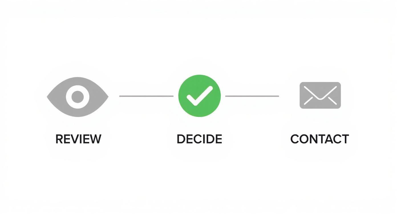
This simple flow is a reminder that your deck has to pass that initial "Review" gate to even be considered for a follow-up. Every single slide counts.
The Team Behind Your Vision
Many investors will tell you they bet on founders, not just ideas. Your team slide is your chance to build that crucial credibility and trust. This isn't the place for full resumes; think of it as a highlight reel.
For each key founder or team member, include:
- A professional headshot.
- Their name and title.
- One or two bullet points highlighting their most relevant experience. Focus on past wins, deep domain expertise, or specific skills that make them uniquely qualified to solve this problem.
Did your CTO lead a successful product launch at a major tech company? Did your head of marketing grow a previous startup’s user base by 500%? These are the details that matter. Show investors you have the right crew to navigate the inevitable challenges ahead.
Feeling the pressure to get all this right? It’s a lot to juggle, especially when you’re also trying to run the business. This is where tools like GenPPT can be a lifesaver. You can feed it your rough notes and data, and it will generate a well-organized first draft. This lets you focus on refining your story instead of wrestling with slide layouts from scratch.
Proving Your Value with Traction and Metrics
Ideas are cheap; execution is everything. You've laid out the market and your brilliant strategy. Now comes the moment of truth in your pitch deck—the slide that grounds your entire vision in reality.
The traction slide isn’t just another part of your presentation. For many investors, it’s the most scrutinized page in the whole deck. It’s where you shift the conversation from "what we plan to do" to "what we've already accomplished."
If you have numbers, this is where you make them sing.

What to Show When You're Making Money
For startups with paying customers, your traction slide should be a highlight reel of your key performance indicators (KPIs). The goal here is to deliver a clear, compelling snapshot of your business's health and, most importantly, its growth trajectory.
Don't just dump a spreadsheet on them. Pick a few core metrics that tell the most powerful story about your business. Visuals are your best friend—simple, clean charts are far more effective than dense tables.
Focus on the metrics that matter:
- Monthly Recurring Revenue (MRR): For any SaaS business, this is the holy grail. It shows predictable income.
- Customer Acquisition Cost (CAC): How much does it cost you to land a new paying customer?
- Lifetime Value (LTV): How much revenue do you expect to make from a single customer over time?
- User Growth: A simple chart showing a steady, upward trend in active users or paying customers says a thousand words.
You're aiming to show a healthy LTV to CAC ratio—ideally 3:1 or higher—and a consistent upward climb in your main growth metric. This proves you have a sustainable business model that’s ready for the fuel an investment provides.
What to Show When You're Pre-Revenue
So, what if you don't have revenue yet? Don't panic. Plenty of startups raise successful seed rounds before earning their first dollar. The game is just different. Your job is to show momentum and validation in other ways.
You have to prove that people desperately want what you're building, even if they aren't paying for it yet. It’s all about de-risking the investment by showing early signs of product-market fit.
Instead of financial metrics, your pre-revenue traction slide can feature powerful alternatives:
- Pilot Program Results: Got data from a successful trial? Showcase engagement stats and positive feedback.
- Letters of Intent (LOIs): These are signed commitments from potential customers who plan to pay once your product is live. In B2B, these are gold.
- Active User Growth: If your product is free, show a chart of weekly or monthly active users. Growth is growth.
- User Testimonials: A few powerful quotes from early adopters provide incredible social proof.
- Waitlist Numbers: A long line of people eager to use your product is a very strong signal of demand.
Traction isn't just about revenue. It's about proof. Prove that you’ve built something people actually want and that you're on the right path.
The data backs this up. Across the board, traction metrics score highest among investor evaluation criteria. A healthcare tech company, for example, successfully raised $8.1M with just 11 slides by focusing on quantifiable benefits. Buffer's early deck secured $330k by highlighting its 55,000 users and $150k ARR.
Even without deep data, simply showing the logos of customers you're working with can build instant confidence. For a masterclass in how winning companies have done this, check out some of the best pitch deck examples.
Telling Your Growth Story
Your traction slide shouldn't be a static snapshot; it needs to tell a story of progress. The "hockey stick" growth curve is a cliché for a reason—it’s the visual every investor dreams of seeing.
Use a simple line or bar chart to show your key metric (users, MRR, sign-ups) on a month-over-month basis. Even if the absolute numbers are small to start, demonstrating a consistent, strong growth rate is what really matters.
Let’s make this practical. Imagine you're building a project management tool. Your traction slide could feature one powerful chart showing user sign-ups over the last six months, annotated with key events.
| Month | New User Sign-ups | Key Milestone |
|---|---|---|
| Jan | 50 | Beta Launch |
| Feb | 120 | Added Integration X |
| Mar | 250 | Featured on Product Hunt |
| Apr | 400 | Launched Referral Program |
| May | 650 | Onboarded First Enterprise Pilot |
| Jun | 900 | Rolled Out New Feature Y |
This table, easily turned into a chart, tells a compelling story. It shows not only that you're growing but why you're growing. It proves you understand the levers that move your business forward.
Whether you're pre-revenue or scaling fast, your traction slide is your evidence. It’s the proof that your idea has legs and is ready to run. A clear, honest, and compelling presentation of your progress can make this the most powerful slide in your entire deck.
Designing a Deck Investors Actually Want to Read
Let's be blunt: a great story can be completely tanked by a terrible delivery. Your pitch deck’s design is often the first real signal of your professionalism and attention to detail. It’s not about flashy animations; it’s about clarity, confidence, and respect for the investor’s time.
Think of it as creating a visually engaging experience without needing a graphic design degree.
The core principle is simple: make your content effortless to absorb. When an investor opens your deck, they shouldn’t have to fight through visual clutter just to find your message.
Embrace Simplicity and Consistency
The best designs are often the ones you don’t even notice. Consistency is your most powerful tool here. Pick one or two professional, easy-to-read fonts and stick with them. Use your brand’s color palette consistently across every single slide for headings, text, and charts.
This isn’t just about looking sharp; it's about reducing cognitive load. When every slide follows the same visual rules, the investor can focus on your business, not on trying to decipher your design choices. A clean, modern aesthetic builds subconscious trust and signals that you’re organized and professional—qualities every investor looks for.
One slide, one idea. This is the golden rule of pitch deck design. If a slide is trying to do too many things at once, its message will absolutely be lost. Keep it focused.
The Power of Whitespace and Quality Visuals
Whitespace—the empty area around your text and images—is not wasted space. It’s an active design element that gives your content room to breathe. Crowded slides feel chaotic and overwhelming, while generous whitespace creates a sense of calm and focus.
It also guides the reader's eye to what's most important. Use it strategically to separate ideas and create a clear visual hierarchy. Your goal is a deck that feels scannable and light, not dense and intimidating.
And please, ditch the cheesy stock photos. Investors have seen them all. Use high-quality product screenshots, professional team photos, or clean icons that actually support your message. If you’re looking for ways on how to make presentations more engaging, focusing on authentic, high-quality visuals is a great place to start.
Data Visualization That Actually Informs
Your financial and traction slides are critical, but a dense table of numbers can be a dead end for an investor’s attention. This is where data visualization becomes your secret weapon. The goal is to turn complex data into simple, digestible charts that tell a story at a glance.
Don't just take my word for it. Research shows that visually engaging pitch decks are 43% more persuasive. Successful founders know this and invest in clean design, moving beyond default templates to craft a compelling visual narrative. This is why investors prefer data in charts—it simplifies complexity and gets to the point faster. You can find more insights on this from the design experts at Canva.com.
For your data, always choose the right chart for the job:
- Line charts are perfect for showing growth over time (like MRR or user sign-ups).
- Bar charts work well for comparing distinct categories (like revenue by product line).
- Pie charts should be used sparingly, and only for showing parts of a whole (like market share).
Always label your axes clearly and use a title that screams the key takeaway, like "Consistent 25% MoM User Growth."
To make this process dead simple, here’s a quick cheat sheet.
Pitch Deck Design Dos and Don'ts
| The 'Do' | The 'Don't' | Why It Matters |
|---|---|---|
| Use one or two clean fonts. | Use five different fonts. | Consistency reduces cognitive load and looks professional. |
| Embrace whitespace. | Cram every slide with info. | Crowded slides overwhelm and hide key messages. |
| Visualize your data clearly. | Use complex, unlabeled charts. | Investors need to understand your traction in seconds. |
| Stick to a consistent color palette. | Use a rainbow of clashing colors. | Brand consistency builds trust and professionalism. |
| Use high-quality, relevant images. | Use cheesy, generic stock photos. | Authenticity matters. Show your actual product and team. |
Remember, your design is part of your story. A clean, well-designed deck signals a clear, well-thought-out business.
With a tool like GenPPT, you don’t have to start from scratch. You can input your raw data and notes, and it will generate clean, professional slides with the right charts already in place. This helps ensure your design is as strong as your story, presenting a polished, investor-ready deck that gets your message not just heard, but seen and remembered.
Nailing Your Ask and Financial Projections
You’ve built a powerful narrative and backed it up with undeniable traction. Now comes the moment to bring it all home. Your final slides—the Ask and the Financials—are where you stop telling a story and start making a concrete proposal.
This isn't just about throwing numbers on a slide; it's about connecting your grand vision to a clear, actionable plan that an investor can get behind. Let’s break down how to close with confidence.
The Ask: Clarity Is Everything
Your "Ask" slide needs to be one of the simplest and most direct slides in your entire deck. This is no place for ambiguity. Investors appreciate founders who know exactly what they need and, more importantly, why they need it.
Start with a bold, can't-miss-it headline: "We are raising $X million." It should be that clear.
Right after that, show them where the money is going. This is your Use of Funds allocation. A simple pie chart or a few crisp bullet points work perfectly here. Your goal is to prove that every dollar has a purpose and is directly tied to hitting your next critical milestones.
A strong Use of Funds breakdown might look like this:
- 40% Product Development: Hiring two senior engineers to build out our next-gen features.
- 35% Sales & Marketing: Launching our go-to-market strategy to acquire our first 1,000 customers.
- 25% Operational Costs: Covering overhead and giving us a solid runway of 18-24 months.
This level of detail shows you’ve actually thought through your operational plan and aren’t just pulling a number out of thin air.
Building Believable Financial Projections
Now for the financials. This slide intimidates a lot of founders, but it doesn't have to. Let me be clear: investors know that a five-year forecast for an early-stage startup is basically an educated guess. They aren't looking for a crystal ball.
What they are looking for is proof that you deeply understand the levers of your business. Your projections are a test of your grasp on your business model, not your ability to see the future.
Your financial slide isn’t about fortune-telling. It’s about demonstrating a firm command of your unit economics and growth drivers. An investor needs to see that you know how the machine works.
Present a simple, high-level forecast for the next 3-5 years. A clean table or bar chart showing projected revenue, key expenses, and profitability is all you need. Resist the urge to cram a complex spreadsheet onto one slide.
Focus on Your Core Assumptions
The most crucial part of your financial slide isn't the final numbers—it's the assumptions that got you there. Just below your chart or table, list the 3-4 key assumptions driving your model.
This is where you connect your financials back to your strategy and prove you've done your homework:
- Customer Growth: "We project acquiring 5,000 new customers per year, based on a conservative 2% conversion rate from our targeted marketing channels."
- Pricing & Revenue: "Our model assumes an average revenue per user (ARPU) of $49/month, with a planned 5% price increase annually."
- Operating Costs: "We project hiring three new team members for every 10,000 customers we onboard."
Showing your work builds immense credibility. It proves you have a realistic, bottoms-up plan for growth. Understanding precisely how your product will make money is critical; if you're in the app space, exploring proven mobile app monetization strategies can help ground your assumptions in industry best practices.
Ultimately, these final slides are your closing argument. A clear Ask and a well-reasoned financial model tell investors that you’re not just a visionary—you’re a builder with a plan. And if you need to turn those messy spreadsheets and notes into a sharp, convincing slide, a tool like GenPPT can help you structure that data in minutes.
Answering Your Nagging Pitch Deck Questions
You’ve poured everything into your deck, and it’s almost there. But a few last-minute questions always seem to pop up, causing that familiar pre-pitch anxiety. I've been there. Let's walk through some of the most common questions founders get stuck on so you can finalize your deck with confidence.
How Much Financial Detail Is Too Much?
This is the classic balancing act, and it’s easier than you think. Your main financial slide needs to be a clean, high-level snapshot. Think of a simple bar chart showing revenue projections for the next three to five years. The goal here isn't to drown an investor in a spreadsheet; it's to clearly communicate that you have a solid grasp of your business model and its potential.
So, where do all the nitty-gritty details go? Tuck them away in an appendix. An investor who’s genuinely interested will ask for your unit economics, burn rate, and the assumptions behind your projections. Having that data ready to go in an appendix shows you’re prepared, professional, and on top of your numbers.
Should I Bother With an Appendix?
Yes, but with a big caveat: don't send it out with your initial deck. Your main presentation should be a lean, compelling story that clocks in at 10-15 slides. The appendix is your secret weapon for the follow-up conversations.
Think of it as the deep-dive resource that backs up every claim you made. A well-built appendix should include things like:
- The detailed financial model and all your key assumptions.
- In-depth competitive analysis or supporting market research.
- Your specific product roadmap or technical architecture diagrams.
- Full bios of key advisors or your extended team members.
Having this ready to share on a moment's notice signals that you’ve done the homework and are ready for the serious due diligence that follows a great first pitch.
What’s the Best Format to Send My Deck?
Always, always, always send your deck as a PDF. It’s the universal standard for a reason. A PDF preserves your design and formatting perfectly across every device, ensuring what you see is exactly what the investor sees. Sending an editable PowerPoint or Keynote file just looks sloppy and risks your carefully crafted design falling apart on their machine.
Your goal is to make it as easy as possible for an investor to say yes. Sending a clean, universally accessible PDF is a small but crucial step in respecting their time and showing your professionalism.
When it comes to sharing, use a trackable link from a service like DocSend or Visible.vc. This is a game-changer. You can see who viewed your deck, how long they spent on each slide, and whether they forwarded it to others. That data is pure gold—it tells you which parts of your story are hitting home and which might need a little more work.
Ready to build a deck that nails your next pitch? With GenPPT, you can turn messy notes and complex data into a clean, investor-ready presentation in minutes. Let's build something sharp, together.